AdaBoost in Classification
Alternatively, use the search bar to find the AdaBoost algorithm. Use the drag-and-drop method or double-click to use the algorithm in the studio canvas.
Click the algorithm to view and select different properties for analysis.
Properties of AdaBoost
The figure below shows the available properties of AdaBoost:-
Field | Description | Remark | |
| Run | It allows you to run the node. | - | |
| Explore | It allows you to explore the successfully executed node. | - | |
| Vertical Ellipses | The available options are
| - | |
Task Name | It is the name of the task selected on the workbook canvas. | You can click the text field to edit or modify the task name as required. | |
Dependant Variable | It allows you to select the dependent variable | You can choose only one variable. It should be of a Categorical type. | |
Independent Variable | It allows you to select the independent variable. | You can select more than one variable. | |
Advanced | Learning Rate | It allows you to change the learning rate accordingly | When the learning rate is higher, it leads to a greater contribution of each classifier. |
Number of Estimators | It allows you to select the number of estimators. |
| |
Algorithm | It allows you to select between the two given options | The options are SAMME and SAMME.R | |
Random State | It allows you to enter the value of the random state. | Enter only numerical value. | |
Dimensionality Reduction | It allows you to select the dimensionality reduction method. |
| |
Example of AdaBoost in Classification
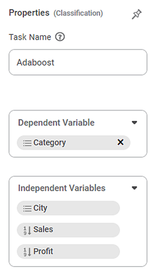
In the example provided below, the Superstore dataset is used to apply AdaBoost. The independent variables considered are City, Sales, and Profit, while the dependent variable selected is Category.
After using the AdaBoost algorithm, the following results are displayed.
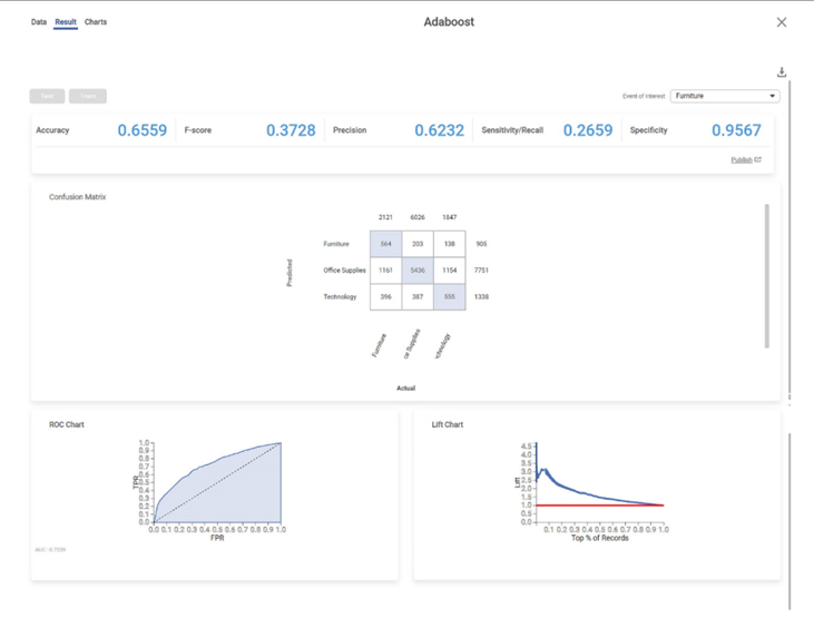
The result page displays the following sections.
Section 1 – Key Performance Index (KPI)

The categorical variable's different options are displayed in the top right corner. Here Furniture variable is displayed. The first option appears as the default selected option.
- Accuracy – This value represents the accuracy of predictions on the model.
- F-Score – This value represents the accuracy of predictions on the selected categorical variable.
- Precision – This value represents the number of false positives.
- Sensitivity/Recall – This value represents the number of positive instances.
- Specificity – This value represents the selected categorical value's ability to predict true negatives.
Field | Description | Remark |
Accuracy | Accuracy is the ratio of the total number of correct predictions made by the model to the total number of predictions made. Accuracy = (TP + TN) / (TP + TN + FP + FN) | The Accuracy is 0.6559. |
F-Score | F-score is a measure of the accuracy of a test. |
|
Precision | Precision is the ratio of the True positive to the sum of the True positive and False Positive. It represents positive predicted values by the model. | Here Precision is 0.6232. |
Sensitivity | It measures the test's ability to identify positive results. |
|
Specificity | It gives the ratio of the correctly classified negative samples to the total number of negative samples: Specificity = TN / (TN + FP) |
|
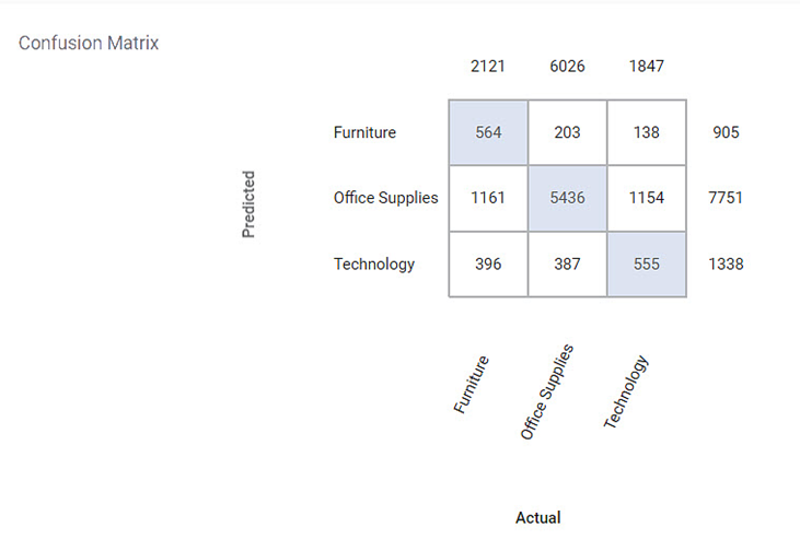
Section 2 – Confusion Matrix
A confusion matrix is a summarized table used to assess the performance of a classification model. The number of correct and incorrect predictions is summarized with count values and broken down by each class.
Following is the confusion matrix for the specified categorical variable. It contains predicted values and actual values for the Category.
- The shaded diagonal cells show the correctly predicted categories.
- The remaining cell indicates the false prediction categories.
Section 3 – ROC chart
The Receiver Operating Characteristic (ROC) Chart is given below. The ROC curve is a probability curve that measures the performance of a classification model at various threshold settings.

- The ROC curve is plotted with a True Positive Rate on the Y-axis and a False Positive Rate on the X-axis.
- We can use ROC curves to select the most optimal models based on the class distribution.
- The dotted line is the random choice with a probability equal to 50%, an Area Under Curve (AUC) equal to 1, and a slope equal to 1.
Section 4 – Lift Chart
The Lift Chart obtained is given below. A lift is the measure of the effectiveness of a model. It is the ratio of the percentage gain to the percentage of random expectation at a given decile level. It is the ratio of the result obtained with a predictive model to that obtained without it.
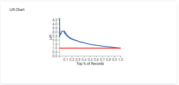
- A lift chart contains a lift curve and a baseline.
- The curve should go as high as possible towards the top-left corner of the graph.
- Greater the area between the lift curve and the baseline, the better the model.
- In the above graph, the lift curve remains above the baseline up to 50% of the records and then becomes parallel to the baseline.
Related Articles
Adaboost
Adaboost is located under Textual Analysis ( ) in Classification, in the left task pane. Use the drag-and-drop method to use the algorithm in the canvas. Click the algorithm to view and select different properties for analysis. Refer to Properties of ...Classification
Notes: The Reader (Dataset) should be connected to the algorithm. Missing values should not be present in any rows or columns of the reader. To find out missing values in a data, use Descriptive Statistics. Refer to Descriptive Statistics. If missing ...Gradient Boosting in Classification
The category Gradient Boosting is located under Machine Learning in Classification on the feature studio. Alternatively, use the search bar to find the Gradient Boosting test feature. Use the drag-and-drop method or double-click to use the algorithm ...Extreme Gradient Boost Classification (XGBoost)
Extreme Gradient Boost is located under Machine Learning () in Classification, in the task pane on the left. Use the drag-and-drop method (or double-click on the node) to use the algorithm in the canvas. Click the algorithm to view and select ...Train Test Split
Train Test Split is located under Model Studio () under Sampling in Data Preparation, in the left task pane . Use the drag-and-drop method to use the algorithm in the canvas. Click the algorithm to view and select different properties for analysis. ...