Target
Target in Solid Gauge Chart
The Target formatting option in the Solid Gauge chart allows you to change the look and feel of the Target value.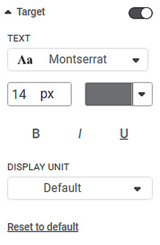
The table given below describes different fields present for Target formatting.
Field | Description | Remark |
|---|---|---|
Text | It allows you to change the appearance of the data label Text. |
|
Display Unit | It allows you to select the multiples of units in which the variable is measured. | You can select any of the following units
Default indicates that the unit is assigned automatically by parsing the range of the data. That is, Thousands/Millions/Billions/Trillions is automatically assigned based on the data. |
To use the Target formatting options in a Solid Gauge chart, first plot the widget.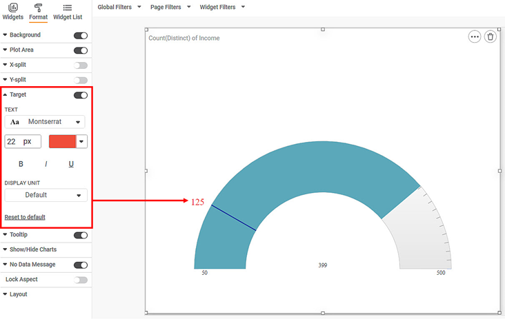
Now,
- Change the Font type, size
- Make the text Bold, Italicized, Underlined
The resultant widget is shown below.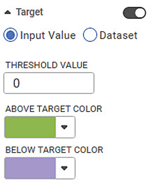
Target in the Sparkline Chart
The Target formatting option is available in Sparkline chart.
By default, the Target formatting options are not visible. Turn the toggle button ON () to use the Target formatting options.
User can define a threshold to be set for color formatting of the horizontal spark lines for each row. Either using an aggregated dataset column value (e.g. Total Cost(sum)) or by entering a number manually (e.g. 10000). The user can then set the different colors for points above and below the selected threshold.
The table given below describes different fields present on Target formatting.
Field | Description | Remark |
|---|---|---|
Input Value | It allows you to enter the threshold value manually. | At a given time, only one can be selected - either Input value or Dataset value. |
Dataset | It allows you to select measure from the dataset as threshold value. | At a given time, only one can be selected - either Input value or Dataset value. |
Threshold Value | This acts as the determining point for rest of the values. | — |
Above Target Color | It allows you to select the color to use for the values that are above the threshold level. | — |
Below Target Color | It allows you to select the color to use for the values that are below the threshold level. | — |
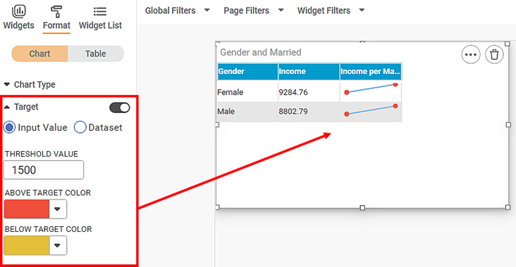
To use Target formatting options, first plot a Sparkline Chart using the dimensions and measures from the dataset. For example, we plot a Sparkline Chart of the Income against Gender and Axis is Married.
The figure given below shows an original image of the Sparkline Chart. By default, Target is off.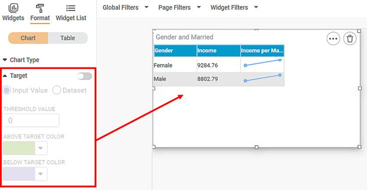
Now,
- Turn the Target On
- Change the Threshold Value
- Change the Above and Below Target colors
The resultant widget is shown below.
Related Articles
Data Value
The Data Value formatting option is available in Bullet Chart. This allows you to select the Minimum, Maximum, and Target values for the chart. Note: These options are visible only if Min/Max/Target is not selected in the Widget Configuration. You ...Gauge Axis
The Gauge Axis formatting option is available in the Solid Gauge Chart. This allows you to select the Minimum, Maximum, and Target values for the chart. Note: These options are visible only if Min/Max/Target are not selected in the Widget ...Data Value
The Data Value formatting option is available in Bullet Chart. This allows you to select the Minimum, Maximum, and Target values for the chart. Note: These options are visible only if Min/Max/Target is not selected in the Widget Configuration. You ...Writing Algorithm Result
The Rubiscape process for analyzing data is - read the data, process it based on the algorithms selected, and display the result. In this process, Rubiscape stores your data only in the temporary cache. After the result is displayed, the resultant ...Drill Through with Keep All Filters
Drill Through with Keep All Filters This option is available from Rubisight dashboard edit mode. This option is available in page format settings. This is used to carry forward all applicable filters on the respective chart which is drilled through. ...