Decimal Place Formatter
Formatting a Table
You can format the tables that appear in various charts. Tables can be plotted standalone like Table and Cross Table, or they accompany other charts (like Sparkline Chart in which they accompany a Line, Area, or Column Chart). The table formatting options are explained below.
Column
The column formatting option is available in widgets like Table, Cross Table, and Sparkline Chart.
Decimal Place Formatter
The decimal place formatter allows you to
- Select the number of decimal places to be displayed in a number
- Select a unit for the displayed number
This option is available in the following widgets for the following entities.
Table:
- Measure Column selected in the Column formatting option
- Total formatting option
- Sub-total formatting option
Cross Table:
- Column Grand Total formatting option
- Row Grand Total formatting option
- Column Sub Total formatting option
- Row Sub Total formatting option
- Value formatting option for the selected measuring section
Sparkline:
Column formatting option for the selected measuring section
Notes: |
|
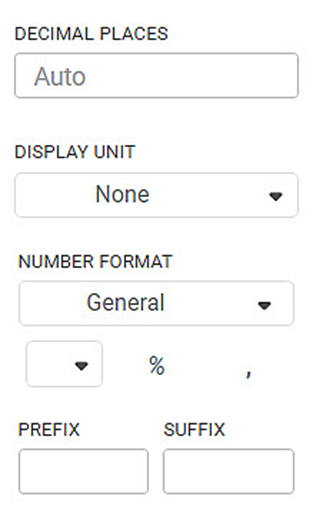
The table given below describes different fields present on the Decimal Place Formatter.
Field | Description | Remark |
|---|---|---|
Decimal Places | It allows you to select the number of decimal places in all the numbers belonging to a selected variable. |
|
Display Unit | It allows you to select the multiples of units in which the value is measured. |
|
To use the Decimal Place Formatter options, first plot a chart using dimensions and measures from the dataset.
For example, we plot a Table of Maximum of Sales by Category and Segment below.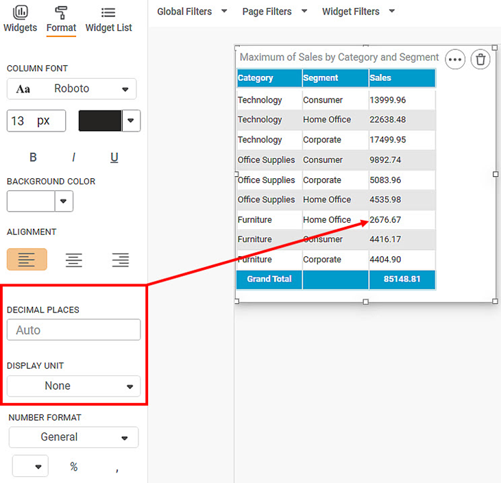
Now, change the
- Decimal places to three (3)
- Display unit to Lakhs
The resultant table is shown below. After each value in the Sales (max) column, the letter ' L' indicates Lakh as the display unit. Also, the respective values are rounded off to the nearest number with three decimal places.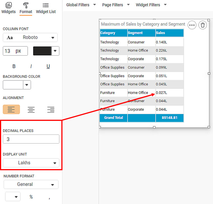
Similarly, you can apply the Decimal Place formatter to Column and Row Grand Total, as well as Column & Row Sub Total in a Cross Table chart.
Below is a Cross Table of the Average of Profit by Ship Mode and Region. The value at the bottom-right corner of the table (434.79) is called the Column Grand Total.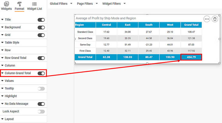
Now, change the
- Decimal places to four (4)
- Display unit to Thousands
The resultant Cross Table is shown below. After each value in the Sales (max) column, the letter ' K' indicates Thousand as the display unit. Also, the respective values are rounded off to the nearest number with four decimal places.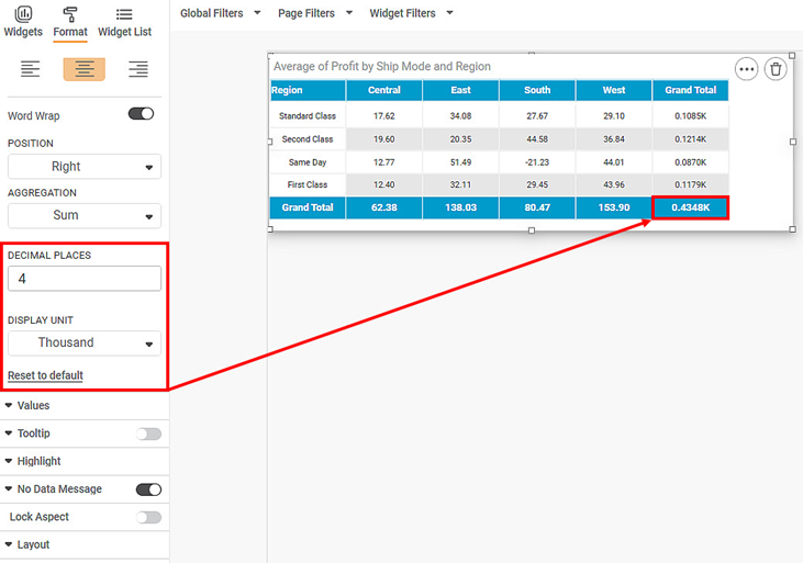
Since Sparkline chart accompanies a column containing numerical variable, you can apply the Decimal Place formatter to it.
Below is a Sparkline chart plotted for Sales per Ship Mode and Order Priority. The Sales(count) is the numerical column to which the decimal place formatter is applied.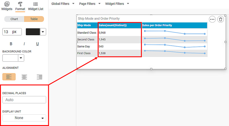
Now, change the
- Decimal places to four (4)
- Display unit to Thousands
The resultant Sparkline Chart is shown below. After each value in the Sales (max) column, the letter ' K' indicates Thousand as the display unit. Also, a zero (0) is added at the end of each value to respect the number of decimal places.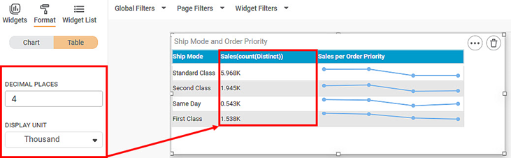
Related Articles
Creating a Google Map Widget
Plotting Google Map Widget (Release 4.2 Onwards) Overview The Google Map widget in RubiSight allows you to visualize geographical data using latitude and longitude coordinates. Data points can be displayed as map markers or circles on the map based ...Configuring Display Unit Mapping
Display Unit Mapping-Formatter To display chart labels/tooltip values/axis labels and such applicable values wherein the display unit is displayed, the formatter -Display Unit Mapping is available in the page level Format pane options. (To Navigate: ...Introduction to Mobile View
Refer Navigate Mobile View to access the Mobile View. To ensure your dashboard is displayed correctly in the RubiSight Mobile Application, you need to configure the Mobile View. Charts can be organized in any desired layout, independent of the layout ...Scrollbar Support in Charts
Scrollbar support allows users to handle large datasets and crowded visuals by enabling horizontal or vertical scrolling on charts. This ensures better readability and avoids overlapping of data points and labels. Overview Enables scrolling on X-axis ...Plot Area- Configure Radius for Pie/Donut Charts
Refer Plot Area for other formatting options. The formatting for the radius options in Pie/Donut charts can be done using Radius formatters in Plot Area formatter for respective charts. Donut Chart Radius Formatter: The 2 formatter options are ...