Live Data
Data visualization is the representation of data in the form of pictures, images, graphs, or any other form of visual illustration.
In RubiThings, Live Data is visualized in the form of Line Chart, SolidGauge, and Speedometer.
To fetch the live data, follow the steps given below.
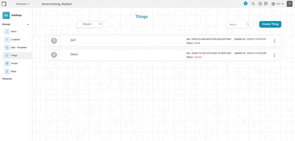
- Click Things in the Manage dropdown. The Things List page is shown.
- Click on the "Active" thing from the Things List page for data visualization. The Things Details page is shown.
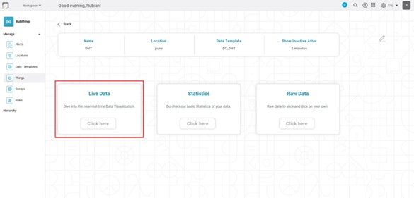
- In the Live Data box, click the "Click Here" button. Live Data Page is shown.
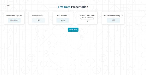
Click the "Select Chart Type" drop–down and select the preferred chart type from the options below.
Chart
Name
Description
Line Chart
A line chart is a graph used to visualize data trends over time. It is a simple and effective way to display how a variable changes with another variable, such as time.
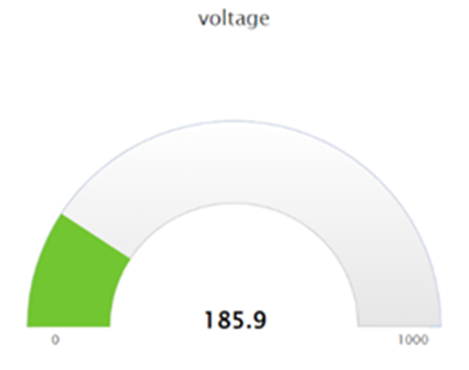
Solid Gauge
A solid gauge is a type of gauge chart used to display a single value on a circular scale.
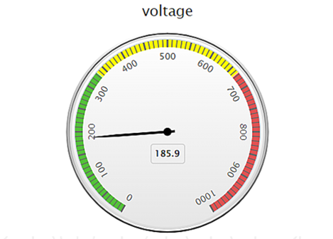
Speedometer
A speedometer chart is a type of gauge chart used to display data in a way that resembles a car's speedometer. The chart displays a single value, typically represented by a needle or pointer that moves along a circular scale.
5. In "Refresh Chart After (Time in Seconds)," enter the time in seconds format.
6. In the "Data Columns" box, click the drop–down arrow and select the available data column.
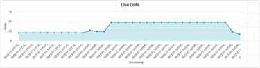
7. Click the "Fetch data!" button. The live chart for the available data is shown.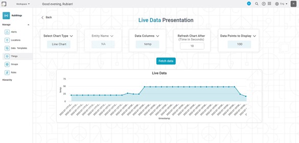
Note | The Number of Data Points to Display option is available for Line chart only. |

Related Articles
Data Compare
Data Compare is located under Model Studio ( ) in Data Preparation, in the task pane on the left. Use the drag-and-drop method to use the algorithm in the canvas. Click the algorithm to view and select different properties for analysis. In the Data ...Data Merge
Data Merge is located under Model Studio ( ) in Data Preparation, in the task pane on the left. Use drag-and-drop method to use the algorithm in the canvas. Click the algorithm to view and select different properties for analysis. Properties of Data ...Data Merge
Data Merge is located under Model Studio ( ) in Data Preparation, in the task pane on the left. Use drag-and-drop method to use the algorithm in the canvas. Click the algorithm to view and select different properties for analysis. Properties of Data ...Data Preparation
Time-series Data Preparation organizes and formats transactional data into time-series data to predict trends and seasonality in the data. Transactional data is timestamped data recorded over a period at no specific frequency, while time-series data ...Data Labels
Data labels refer to the text, values, or a combination of both, that appear on a chart. For example, a data label on a Column chart gives you information about the variable plotted on the Y-axis corresponding to that column. By default, the data ...