Number Format
Number Formatting allows you to change the way numerical entities appear on the X and Y-axes. It is applicable for features under Measures (numerical variables).
The figure below shows the available Number Format options.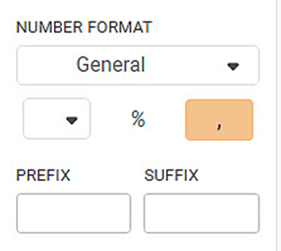
The table given below describes different fields available for Number Formatting.
Field | Description | Remark |
|---|---|---|
| It allows you to select the format in which the number is displayed. | The following options are available:
|
| It allows you to select the Currency and its symbol next to the number on the axis. |
|
% (Percentage) | It allows you to convert the axis values into a percentage. | The remaining two options (Currency and Comma) are disabled when applying the percentage. |
',' (Comma) | It allows you to insert a comma in numbers as per the conventional standards. | This option is disabled when you use the percentage option. |
Prefix | It allows you to add a prefix to the axis value. | It is used when you want to add a time or currency indicator to the value. |
Suffix | It allows you to add a suffix to the axis value. | It is used when you want to add a time or currency indicator to the value. |
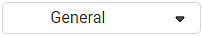

To use the Number Format option, first plot a Column Chart using the dimensions and measures from the dataset. For example, we plot a Column Chart of the Maximum of Sales by Segment. The Region is used as the Legend.
The figure given below shows the original Column Chart. The General number format selection indicates that the Sales values (on Y-axis) are the default values in the dataset.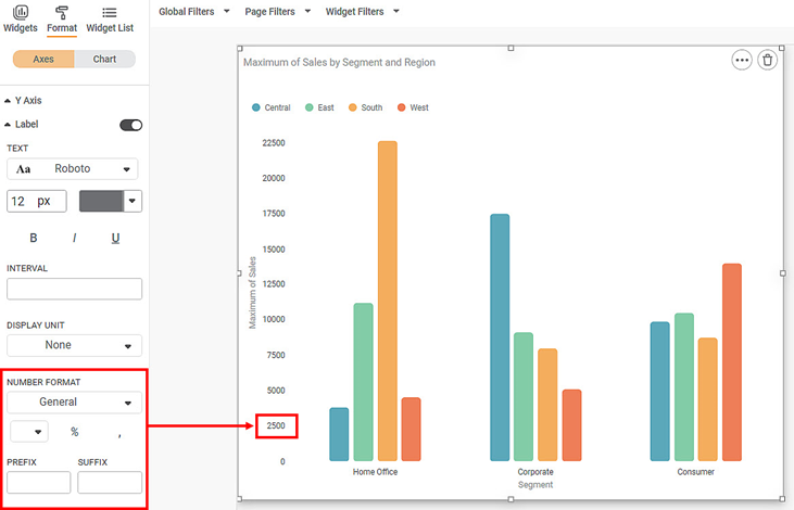
Now,
- change the number format settings to Currency and
- select Euro from the currency dropdown.
The resultant widget is shown below.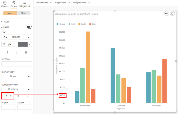
You can simultaneously apply the Comma separator for the values.
The resultant widget is shown below.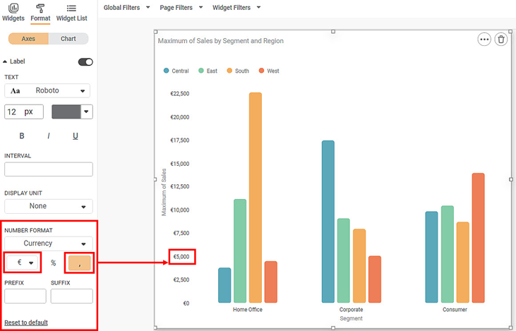
Now, select the Percentage option. Subsequently, the Currency and Comma options are disabled for selection.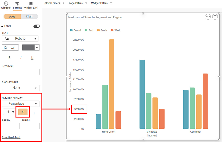
Also, enter a suitable PREFIX or SUFFIX in the designated fields for the axis values.
The resultant widget is given below.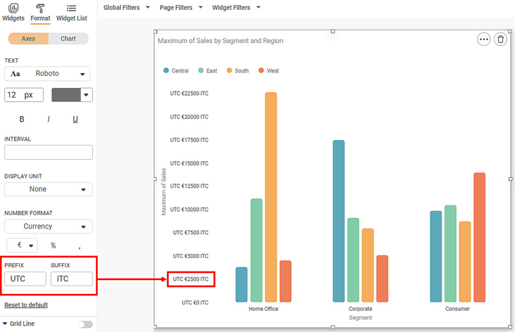
Related Articles
Comma Format Options in Number Formatting
Overview Comma Format options allow users to display numbers based on region-specific digit grouping and separators. These options are available under the Comma Format dropdown and are enabled only when comma formatting is turned ON. Supported across ...Number Plate Detection
For Number Plate Detection, the pre-trained models used are Pytesseract Trained Neural Network Notes: Pytesseract is an independent library inside Python for text detection in images. It can detect alphanumeric as well as special characters from the ...Number Plate Detection
For Number Plate Detection, the pre-trained models used are Pytesseract Trained Neural Network Notes: Pytesseract is an independent library inside Python for text detection in images. It can detect alphanumeric as well as special characters from the ...Date and Time Formatting on Chart
In RubiSight, when you plot a chart using the Date and Time formatting feature, the coordinates of the plot appear in the standard ISO format, by default, as given below. Format: YYYY-MM-DD HH:MM:SS Where, YYYY-MM-DD is the date components of the ...Formatting a Table
This formatting applies to widgets that contain tables. For example, table formatting is possible for widgets such as Table and Cross Table. To format the chart, follow the steps given below. Create the number of charts as required. Refer to Creating ...