Show Hide Charts
You can hide a widget if it is not required to be displayed on the dashboard for any reason. The multiple scenarios for using this functionality are given below.
Scenario 1: Show/Hide a Chart Manually
For hiding a widget manually, click Widget List, hover over the widget title, and click the Hide Widget Icon ( ).
).
The widget gets hidden (disappears) from the Dashboard page. Also, the widget title in the list gets blurred, and a Show Widget Icon ( ) appears next to it.
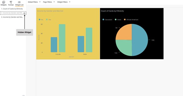
If you want to view the widget again, click the Show Widget Icon ( ). The widget appears in the same position.
Note: | You can use this functionality in the Edit Mode only. |
Scenario 2: Show/Hide a Chart using Condition
In RubiSight, you can choose to show or hide charts based on a specific condition using the Show/Hide Charts formatting option. It applies to all widgets.
To use Show/Hide Charts formatting option, plot a chart using the features from the dataset.
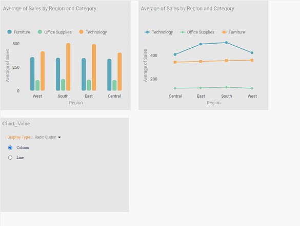
For example, we plot a Column Chart and a Line Chart using the same set of dimensions and measures: the Average of Sales by Region and Category.
Also, we create a binary categorical parameter named Chart_Value for the two charts, with two values, Column, and Line, as shown below.
We plot a Parameter widget on the same dashboard page using this parameter. Refer to Using Parameters in RubiSight in RubiSight User Guide.
The default value for the created parameter is Column.
The figure below shows the dashboard containing the two charts and the Parameter Widget in the Edit Mode.
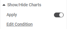
To apply the Edit Condition,
- Turn the Apply toggle "ON".
- Select the dataset.
- Click Edit Condition.
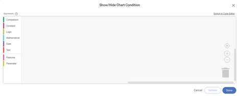
The Show/Hide Chart condition window is displayed. - Create a condition using the Expression Builder.
The expression created in the builder should- either be a conditional statement or
- should have Boolean values (true or false) as output
Notes: |
|
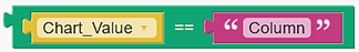
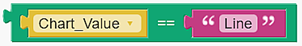
For example, we use the Comparator Operator (==) to create conditions separately for the Column and Line charts using the created parameter.
We create the following expression for the Column Chart. When the Chart_Value = Column, the Column Chart is shown; else, it is hidden.
Also, we create the following expression for the Line Chart. When the Chart_Value = Line, the Line Chart is shown; else, it is hidden.
The above expressions are valid because their output can be True or False.
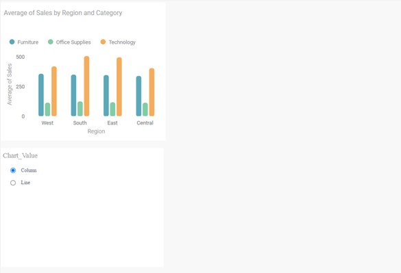
Now, switch to the View Mode. Since the default value for Chart_Value is Column, the Column Chart is shown, and Line Chart is hidden.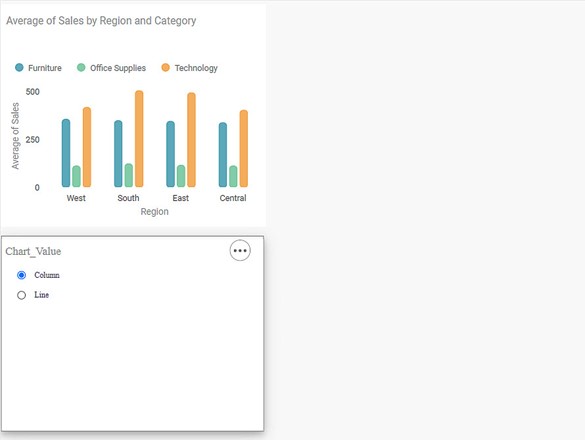
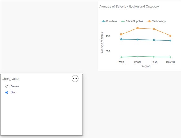
Now, select the radio button for the Line option in the Parameter Widget. The Chart-Value is Line for the Line Chart. Hence, the Line Chart is shown, and Column Chart is hidden.
Scenario 3: Show/Hide using a Boolean Constant String Value (True/False)
Now, from Scenario 2,
- Change the Show/Hide Condition for the Column Chart from Chart_Value == Column to simply True. It means that the Condition for the Column Chart is always true.
- Keep the Condition for the Line Chart unchanged.
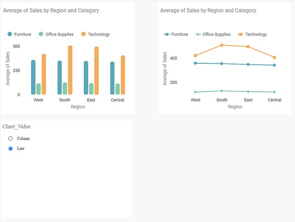
If you switch to View Mode, you see that the Column Chart is always shown for any selection of the Parameter widget.
Case 1: When the Parameter Widget selection = Column
Case 2: When Parameter Widget selection = Line
Scenario 4: Show/Hide using Features
You can use the features/columns from the dataset used to plot the chart for the show/hide condition.
Condition: "If the selected value (while creating the expression) corresponds with the first value in the sorting order of the feature, the column is shown in the View Mode, else hidden."
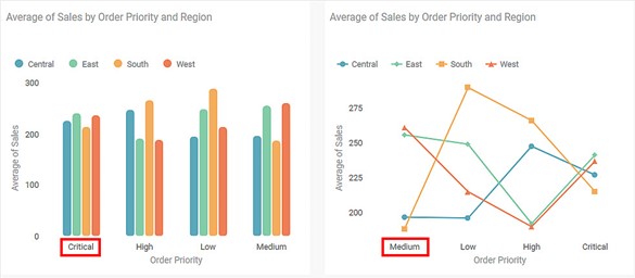
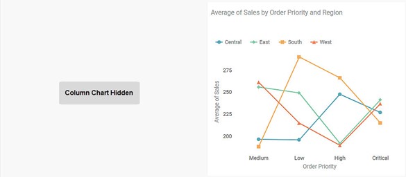
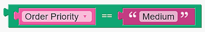
For example, we plot a Column and a Line Chart for the Average of Sales by Order Priority and Region. The first value for Order Priority in the two charts are Critical and Medium, respectively, as shown below.
Next, we create the following expression for both charts. When the Order Priority = Medium, the charts are shown, else hidden.
Now, switch to the View Mode. The Column Chart is hidden while the Line Chart is shown since it satisfies the Condition.
Scenario 5: Show/Hide for Text, HTML, and Image Widgets
Although Text, HTML, and Image widgets do not need datasets to plot, you can still apply the Show/Hide condition on them using a dataset present in the dashboard. Once you select a dataset for any charts, you can create a condition using a feature present in the dataset.
Click Format and click the Select Dataset drop-down to add a dataset. Select the dataset you want to add to the charts from the list.
For example, in the dashboard, we have a dataset named Sp_Sample_Superstore. It contains a feature named Order Priority with four categorical values C (Critical), H (High), M (Medium), and L (Low).
.jpg)
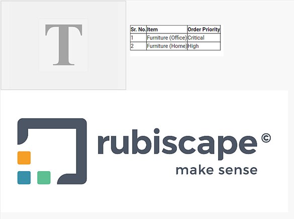
For example, we plot a Text Chart, an HTML Chart (a simple table), and an Image Chart, as shown below.
The snippet of the dataset used to plot the charts is shown below.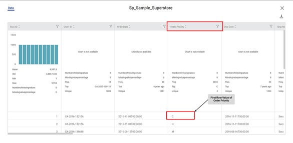
As you can see, the value in the first row for Order Priority is "C."
Next, we create the following conditions for the three charts as explained above.
- For Text and Image Charts, Order Priority = C
- For HTML Chart, Order Priority = M
Now, switch to the View Mode. The HTML Chart is hidden while the Text and Image charts are shown since they satisfy the Condition.
Related Articles
Highlight- Hide Values Support
The option Hide Values, is available to configure highlighting with or without showing data values. This option is available in Highlight configuration for Table, Sparkline and Cross Table. When data values are hidden, the Style Icon is shown or ...Show Hide Page in Rubisight Dashboard
1. Overview • The Show / Hide Page feature allows users to control page visibility within a dashboard. • This is useful for restricting access, staging content, or simplifying navigation. 2. Default Behavior • All newly created dashboard pages ...Generate and Plot Charts
Generate and Plot Charts RubiAI lets you generate the chart based on user prompts and also enables user to plot the chart in the Rubisight dashboard. Generate and plot option is available from Edit mode of the dashboard. From view mode user can ...Scrollbar Support in Charts
Scrollbar support allows users to handle large datasets and crowded visuals by enabling horizontal or vertical scrolling on charts. This ensures better readability and avoids overlapping of data points and labels. Overview Enables scrolling on X-axis ...Data Labels in Pie and Donut Charts
Refer Data labels for using general formatting options for the charts. Along with these options, Pie and Donut charts are provided with additional formatting options. The below options are available with their respective formatting options- Figure 1: ...