Text Background
In RubiSight, three Background formatting options are available for Text Widget.
- Gradient
- Image
- Border
The Gradient and Image formatting options can be applied independently. Border can be applied along with both, Gradient and Image.
The Background formatting options are not visible by default. Click the toggle button ON to format the Text Widget background.
Also, to access all the Gradient formatting options, select the Gradient check box.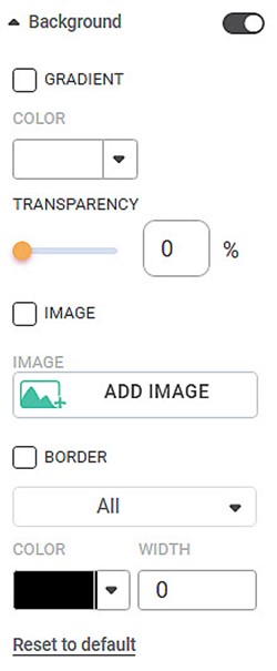
The table given below describes different fields present under Background on the Text Widget’s Format pane.
Field | Description | Remark | |
Gradient | Color 1 | It allows you to select the primary color for the background of the Text Widget. |
|
Color 2 | It allows you to select the gradient color for the background of the Text Widget. |
| |
Gradient Direction | It allows you to select the position of the Gradient in the background of the Text Widget. |
| |
Image | Add Image | It allows you to select an image for the background. |
|
Border | Border | It allows you to select a border for the Text Widget. |
|
Color | It allows you to select the border color. | The default color is Black. | |
Width | It allows you to select the border width. | The default width is zero; that is, there is no border to the widget. | |
To use Background formatting options, first plot a Text Widget. For example, we plot a Text Widget with the following message –
“Welcome to Rubiscape”
The figure given below shows an original image of the Text Widget. By default, there is no background applied to the widget.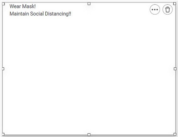
Notes: |
|
To add a gradient color as a background,
- Change Color 1 and Color 2.
- Select the Gradient Direction.
The resultant Text Widget is shown below.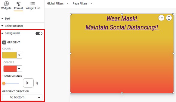
Notes: |
|
To add an image as a background,
- Select the Image check box.
- Click Add Image to select an image from your local machine, a shared network location, or the web.
Note: | If you want to add an image from the web as a background, the image should first be downloaded to your local machine. |
The resultant Text Widget is shown below.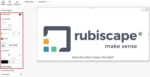
Also, to apply border to the Text Widget,
- Select the Border check box.
- Select the border orientation from the Border drop-down.
- Select the border color from the Colour drop-down.
- Select the border width from the Width drop-down.
The resultant Text Widget is shown below.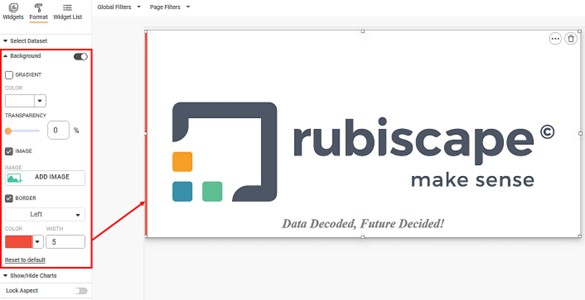
Related Articles
Highlight- Option for Fetch Original Text Formatting
The Fetch Original Text Formatting option allows you to apply highlight settings using the text formatting already defined at the column level. When clicked, it retrieves formatting attributes such as font type, font size, bold, italic, and ...Background
Background refers to the entire space in which the widget and its allied information, like title, legend, and subtitle, are located. By default, the background formatting options are not visible. Turn the toggle button ON () to format the background. ...Text
The Text formatting option is available in the Text widget. The table given below describes different fields present on Text widget formatting. Field Description Remark Text It allows you to edit the text shown in the Text Chart. — Text Font It ...Text
Creating Text Dataset To create a Text dataset, follow the steps given below. On the home page, click Create icon . The Product Selection page is displayed. Hover over the Data Connect tile and click Create Dataset. Dataset Selection page is ...Generate Smart Insights with Text/Image Processing
Smart Data Insights - Dashboard Data vs External Text/Image: RubiAI allows you to generate Smart Insights wrt dashboard data and the uploaded Text/Image file. You can attach any file in the text formats- word, , csv, excel, pdf, text and image ...