Title
The title refers to the most important information about the widget that is plotted. It contains the names of the parameters/variables used to plot the widget. You can also include any important information about the widget, like its purpose, in the title.
By default, the title formatting options are not visible. Turn the toggle button ON to format the title.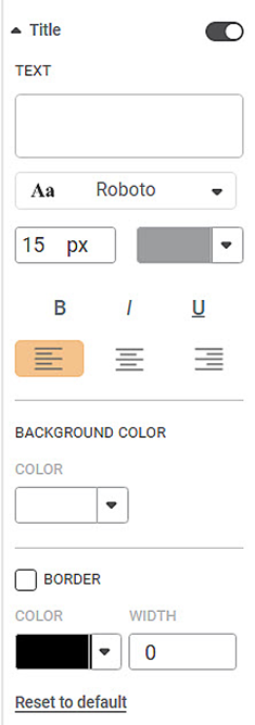
The table given below describes different fields present on Title formatting.
Field | Description | Remark |
|---|---|---|
Text | It allows you to give a suitable title to the widget created. | By default, the variables used to create the widget appear in the title. |
Background Color | It allows you to change the background of the region where the title is displayed. | By default, the color is white. |
Border Color | It allows you to select a color for the border given to the region where the title is displayed. | To apply the border color and width, select the corresponding check box. |
Border Width | It allows you to change the width of the border given to the region where the title is displayed. |
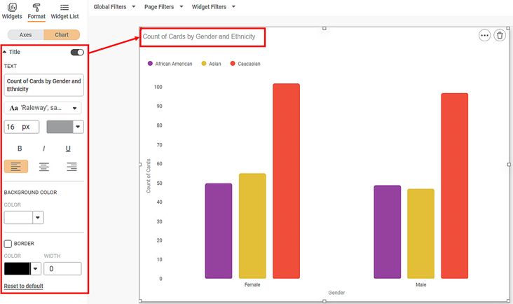
To use Title formatting options, first plot a Column Chart using the dimensions and measures from the dataset. For example, we plot a Column Chart of the Count of Cards against Gender. The Ethnicity of the sample is the Legend dimension.
The figure given below shows an original image of the Column Chart. By default,
- The title of the chart contains information about the plotted variables. In the chart below, the title is "Count of Cards by Gender and Ethnicity".
- The background of the title is the same as the canvas on which the widget is plotted.
- The title does not have a border.
Now,
- Change the title text.
- Change the title text font type, font size, and font color.
- Make the title bold, italic, and underline it.
- Change the background color of the title.
- Give a suitable border to the title. Change its color and width.
The resultant widget is shown below.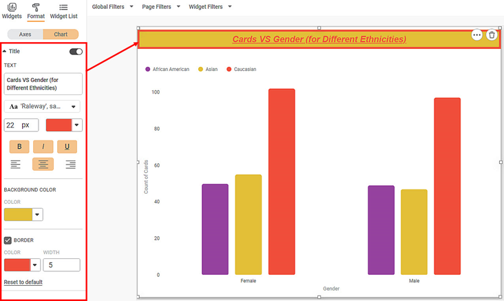
Related Articles
Axis Title
The Axis title is the heading that you want to give to the X-axis. The table given below describes different fields present on Axis Title formatting in X-axis. Field Description Remark Text It allows you to give a suitable title to the axis. Axis ...Axis Title ( Y-axis)
Axis title is the heading that you want to give to the Y-axis. The table given below describes different fields present on Axis Title formatting in Y-axis. Field Description Remark Text It allows you to give a suitable title to the axis. Axis title ...Legend
A legend (in a chart or graph) shows the kind of data represented by the chart. Legends give the explanation of the markings, symbols, colors, and characters on a chart or graph. The figure given below shows the various fields present in the Legend ...Widget List
The Widget List option is present in the Widget pane, next to Widgets and Format tabs. The Widget List is used to display the list of plotted widgets on a Dashboard page in a particular sequence. The last plotted widget appears first in the list, ...Logging Out of the Application
Default Log out To log out from Rubiscape, follow the steps given below: On the title pane, click the user icon ( ). Click Log out. Log out With B2B While logging out, you will be shown a list of all Microsoft application accounts of all users that ...