Understanding RubiSight Home Page
RubiSight home page is the area where you create data visualization using charts and graphs. When you create a new dashboard, the following icons and fields are displayed.
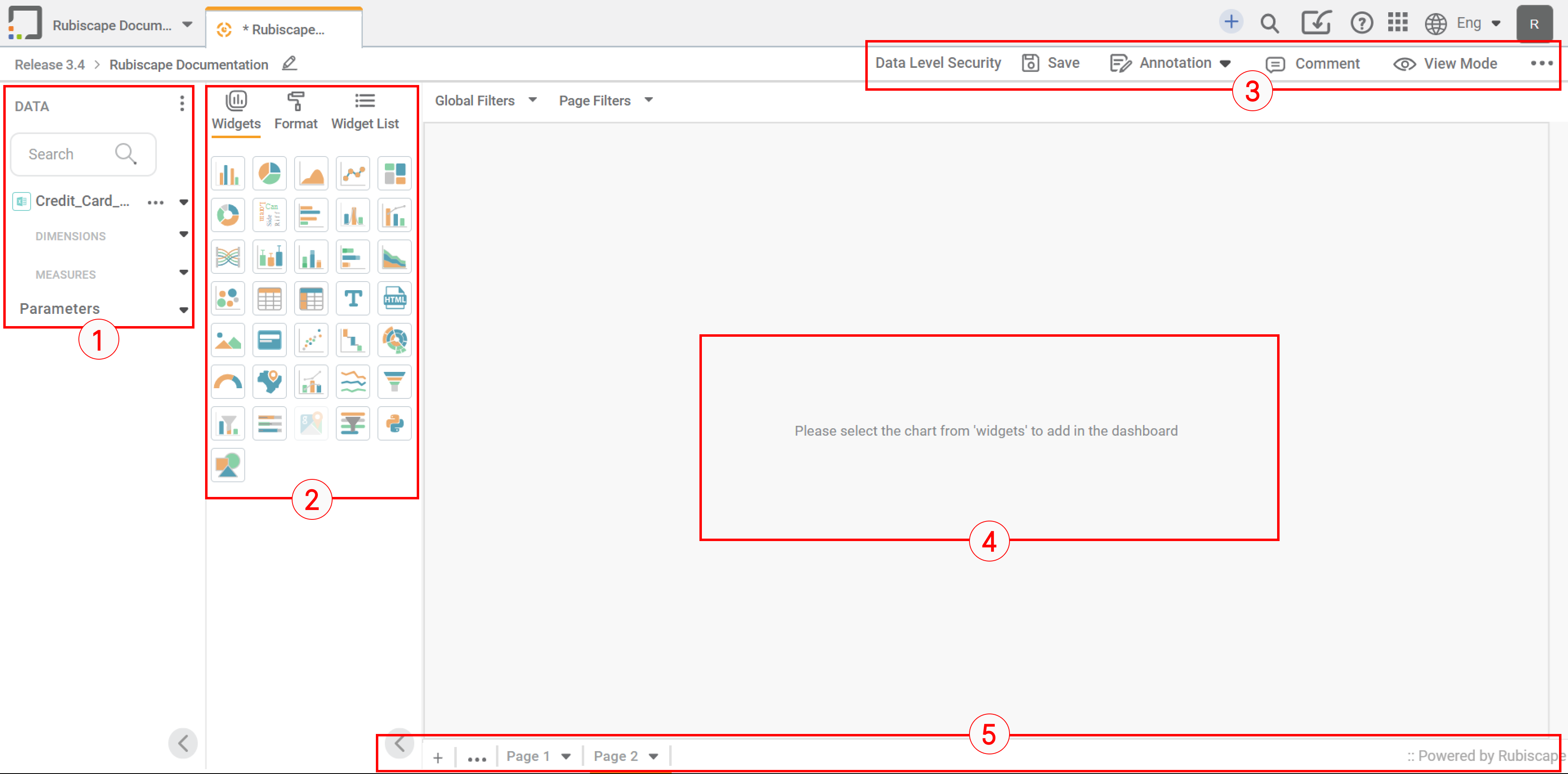
The dashboard screen has four panes, as given below.
- Data Pane: This pane displays the datasets and their dimensions and measures that can be used in the dashboard.
- Widgets Pane: This pane displays the several types of charts, graphs, and tables used in the data visualization dashboard. It also displays the detailed formatting options associated with the widgets.
- Function Pane: This pane displays the various functions that can be performed on the dashboard.
- Dashboard Canvas: This is the work area where you can create widgets of your choice, select the parameters to plot them and format them according to your requirement.
- Dashboard Page bar: This bar lists the pages that are created in a dashboard. You can create more pages, rename them, or move them right or left.
The table below describes the fields and icons on the Workbook Canvas.
Icon/Field | Description | |
Data pane | It displays the list of datasets, and a list of dimensions and measures present in them. | |
Widget Pane | It displays all the available widgets, that is, charts, graphs, and tables used for data visualization. | |
Function pane | ||
Data Level Security | It helps to restrict access to the data in dashboards. | |
| Save | It saves your dashboard. |
| Annotation | It helps you to number the charts and graphs. |
| Comment | It helps you comment on the dashboard. |
| View Mode | It displays the dashboard in the 'view only' mode. You can define column-level access on the database, which will show data of only the allowed columns. |
| Ellipsis | It displays the following additional functions that are available in the function pane.
|
Dashboard Canvas | It is the area where you can create charts, tables, maps and other widgets for the selected datasets. The selected widget can be plotted using various configuration parameters and modified with various formatting options. | |
Dashboard Page bar | This bar lists the pages that are created in a dashboard. You can create more pages, rename them, or move them right or left. | |


Dimensions measure conversions
The dashboard contains various panes like Data Pane, Widget Pane, and Function Pane. The Data Pane consists of Dimensions and Measures. In Rubiscape, all dataset numerical variables are considered as measures. Other than numerical variables are displayed as Dimensions. However, many times you face an issue to display independent values. In such a case, you need to convert the measure to dimensions and vice versa. Let's have a look at how to convert it.
Follow the steps mentioned below.
- In the Data pane, click on the three dots, that appear next to the variable.
- Click on the convert button
The figure below displays the Convert option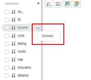
When you click on the Convert option, a popup window opens. You can modify the variable type in this window.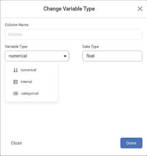
You can convert the variable to the numerical, interval, and categorical types. The variable contains characters other than numbers. You convert this variable to numerical. In such a scenario, you will see only the Count aggregate function. Once you convert the variable type, the variable is displayed in the Dimensions or Categorical section.
Notes: |
|
Example of a Measures to Dimension conversion
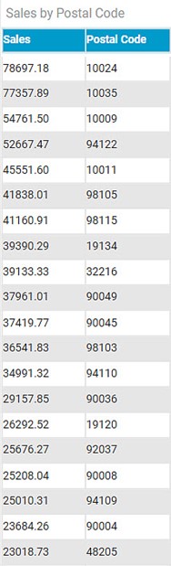
Consider Sales Dataset with measures like Postal Code, Sales, Quantity, and Discount. You want to use a table widget to display Postal code-wise sales.
A postal Code is a numeric field. It appears in the measures section. When you select the Postal code as a measure, you have to use aggregate functions like Sum, Count, and Min. You are not able to display the data in table format.
The following figure displays the table data when Postal Code is in measure.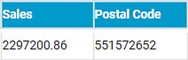
The following figure displays the table data when the Postal Code variable is converted to a Categorical variable.
Related Articles
Understanding the Application Home Page
Your home page is the default workspace assigned to you as a user. The home page has four panes and a quick tour icon, as given below. Title pane: This pane displays options to go to the home page and change the workspace. It also displays options to ...RubiSight Mobile Application – Home Screen
RubiSight Mobile Application – Home Screen · The Home Screen is the default landing page after you log in to the RubiSight Mobile Application. · It provides quick access to dashboards, recent activity, and navigation menus for seamless exploration of ...Canvas Grid Functionality
Grid support helps designers align and organize visuals precisely on the canvas using an underlying layout structure. Overview Grid is available for Rubisight Designers The grid is visible only in Edit Mode It helps in maintaining consistent spacing ...Drill Through from Chart to Page with Context Filtering
Drill Through Filters (Page Level) Overview Drill Through Filter option is available at the page level in the Filter Pane and is accessible from Edit/View/Outer modes. It enables navigation from one widget to another page while passing contextual ...Show Hide Page in Rubisight Dashboard
1. Overview • The Show / Hide Page feature allows users to control page visibility within a dashboard. • This is useful for restricting access, staging content, or simplifying navigation. 2. Default Behavior • All newly created dashboard pages ...