Values
Values formatting option is available in the Cross Table widget.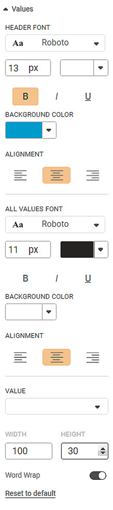
The table given below describes different fields present on Values formatting.
Field | Description | Remark |
|---|---|---|
Header Font | It allows you to change the appearance of the Header row. |
|
Background Color | It allows you to change the background color of the header row. | — |
Alignment | It allows you to change the text alignment of the header row. | You can align the text to Left, Centre, or Right. |
All Values Font | It allows you to change the appearance of the table rows. |
|
Background Color | It allows you to change the background color of the table rows. | — |
Alignment | It allows you to change the text alignment of the table rows. | You can align the text to Left, Centre, or Right. |
Width | It allows you to change the width of the selected row. | — |
Height | It allows you to change the height of the selected row. | — |
Word Wrap | This toggle button helps you to turn the word wrapping ON or OFF. | — |
To use Values formatting options, first plot a Cross Table chart the measures from the dataset. For example, we plot a Cross Table Chart of Average of Income and Average of Cards.
The figure given below shows an original image of the Cross Table Chart.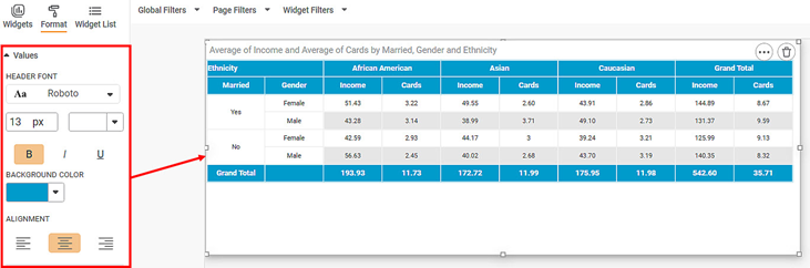
Next, change the font type, size, background color, alignment of the values in the Header row.
The resultant widget is shown below.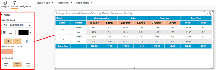
Next, we change the All Values formatting options.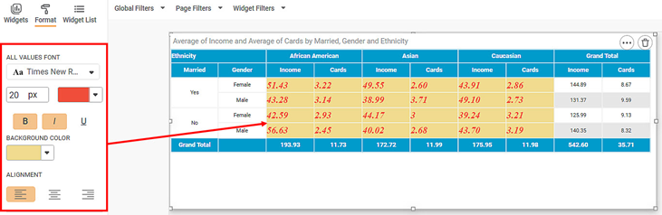
Related Articles
Merge Same Values
The Merge same values option allows you to merge rows containing same values for the selected dimension. This option is available under Column option in Table, Cross Table, and Sparkline charts and is visible only after you select a column. Note: ...Highlight- Hide Values Support
The option Hide Values, is available to configure highlighting with or without showing data values. This option is available in Highlight configuration for Table, Sparkline and Cross Table. When data values are hidden, the Style Icon is shown or ...Setting Variable Values from Scheduled Pipeline Execution
This functionality allows users to assign specific values to pipeline variables at the schedule level. When a pipeline runs through a schedule, the variable values defined in that schedule override the global variable values. This enables dynamic, ...Top N Bottom N
The Top N/Bottom N refers to the top (highest/largest) N values and bottom (lowest/smallest) N values or ranks in the aggregated values of the selected measure in the dataset. For example, if N = 15, then corresponding to a particular variable, we ...Show blank as zero
Showing blanks as zero in widgets Show Blank as Zero functionality allows you to represent Null values as zero in widgets. It is available in line chart, column chart, bar chart, stacked bar chart, stacked column chart and Combination chart. By ...