Chart Type
The figure below shows the formatting fields in the chart type dropdown.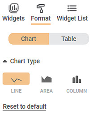
To use Chart Type formatting options, first plot a Sparkline Chart using the dimensions and measures from the dataset. For example, we plot a Sparkline Chart of Ethnicity against Gender.
The figure given below shows an original image of the Sparkline Chart. By default, the Chart Type is Line.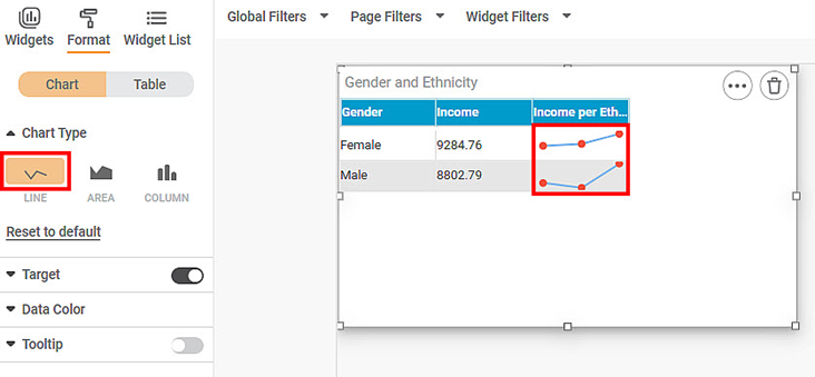
Now, change the Chart Type to AREA.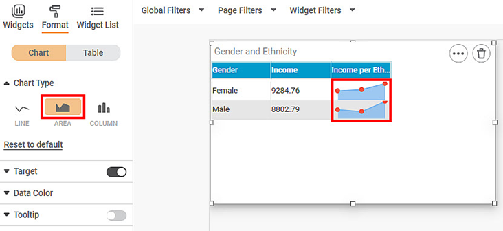
Now, change the Chart Type to COLUMN.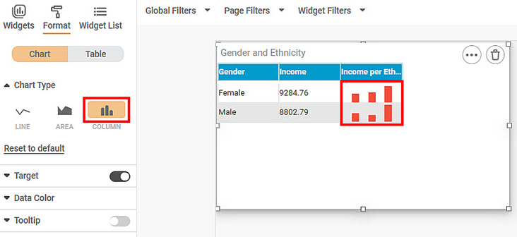
Related Articles
Chart Type
The figure below shows the formatting fields in the chart type dropdown. To use Chart Type formatting options, first plot a Sparkline Chart using the dimensions and measures from the dataset. For example, we plot a Sparkline Chart of Ethnicity ...Plot Type
The Plot Type formatting option is available in the Combination Chart. The table given below describes different fields present for Plot Type formatting. Field Description Remark Column Organization of data in the column. The values are: CLUSTER – ...Formatting a Chart
This formatting is applicable for widgets that do not have axes. For example, chart formatting is possible for widgets such as Pie Chart and Donut Chart. The figure given below shows the available formatting options for a chart. These options may ...KPI/Chart suggestions
RubiAI allows you to suggest the possible charts/KPIs to get the insights from the data. This is shown in the table format and details – Chart Name, Chart Type, Data, Filter, Description. To use this functionality, follow below steps: 1. Navigate to ...Formatting a Chart
This formatting is applicable for widgets that do not have axes. For example, chart formatting is possible for widgets such as Pie Chart and Donut Chart. To format the chart, follow the steps given below. Create the number of charts as required. ...