Formatting a Chart
This formatting is applicable for widgets that do not have axes. For example, chart formatting is possible for widgets such as Pie Chart and Donut Chart.
To format the chart, follow the steps given below.
- Create the number of charts as required. Refer to Creating Charts using Widgets.
- Select the widget that you want to format.
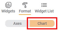
- In the WIDGET pane, click FORMAT.
Depending on the selected type of widget, the formatting options are displayed. - Click Chart.
The formatting options for Chart are displayed. - To enable and format a field, turn the corresponding toggle button ON (
 ).
).
For example, here, we have enabled the Legend field.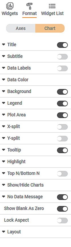
- Click Legend.
All the formatting options within the Legend field are displayed. You can change, - Position of the legend on the chart
- Text of the legend and its font settings
- Background color of the legend
- Border of the legend
- Border color and border width of the legend
- Title of the legend and its font settings
You can also reset all settings to default and undo all changes made to the widget.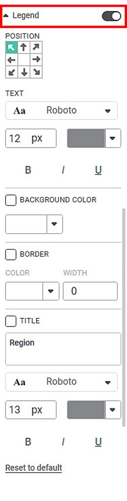
Similarly, for Chart, you can format other fields like Plot Area, Tooltip, Data Labels, Data Color, Title, Subtitle, Background, No Data Message, Layout, Top N/Bottom N, and Lock Aspect to format the chart as required.
Related Articles
Comma Format Options in Number Formatting
Overview Comma Format options allow users to display numbers based on region-specific digit grouping and separators. These options are available under the Comma Format dropdown and are enabled only when comma formatting is turned ON. Supported across ...Formatting a Chart
This formatting is applicable for widgets that do not have axes. For example, chart formatting is possible for widgets such as Pie Chart and Donut Chart. The figure given below shows the available formatting options for a chart. These options may ...Card Chart Data Labels Datetime formatting
Card chart when plotted with Date/Interval column types with Minimum/Maximum aggregation shows the Minimum/Maximum date out of that column. Default date format is displayed in ISO format. The customization for datetime can be done using the available ...Highlight Formatting for Solid Guage Chart
Before you walk through the below guide to set the Highlight on Solid Guage chart, you can refer Highlight for getting more details of the Highlight option to set the conditional formatting on the chart. For Solid Guage chart, to set the Conditional ...Contextual Data Tooltips
Tooltip configuration allows you to display additional information from the source dataset that is not directly plotted on the chart. This enhances data visibility by providing contextual insights when users hover over chart elements. Overview ...