Creating a Map Widget
In RubiSight, you can create a map widget if your dataset contains geographical variables.
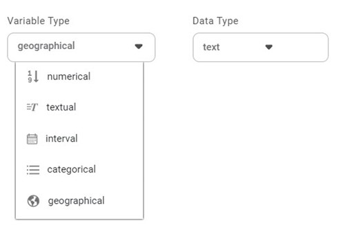
Geographical Variable
In RubiSight, a new variable type called geographical is added to represent a location. It is supported for the below-listed location identifiers.
- Region
- State
- Country
- Continent
- Subcontinent
The geographical variable is denoted by the earth symbol ( ), and its Data Type is Text.
To create a dataset containing Geographical variable type, refer to Creating a Dataset with Geographical Variable Type.
Notes: |
|
Creating a Map Widget using Geographical Variable
In RubiSight, a geographical variable type is used to represent the location type of features on Map widgets.
To add a dataset containing a geographical variable type column and plot a Map Widget, refer to Creating Visualization using Widgets on Dashboard.
In the following example, we create a Map widget using the Rainfall in India In February 2023 dataset. In the dataset, the Location column contains the names of Indian states/regions and union territories, which are geographical variables.
We plot the data for the Average Rainfall by States.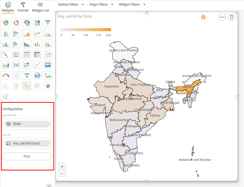
Notes: |
|
Scenario 1:
In datasets containing regions from India, you can view different maps –
- India with Disputed Territories
- India with Andaman and Nicobar
For example, the map plotted in the figure is of India with Disputed Territories.
To change the map, follow the steps given below.
- In the widget pane, click Format.
The Map Widget formatting options are displayed in the pane. - Click the Region drop-down.
- Type the name of the map that you want to view. Partial text is also allowed.
In the example, we select India with Andaman and Nicobar.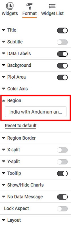
The map is changed to India with Andaman and Nicobar.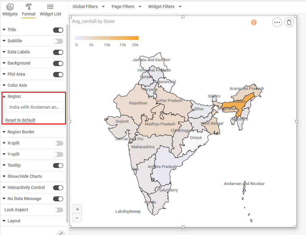
Notes: | In this map, you can see,
|
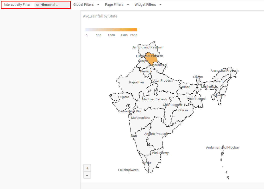
Scenario 2:
In View Mode, you can apply the interactivity filter by selecting a region. In this case, only the selected region is highlighted, and other regions are disabled.
In the example, when you click Himachal Pradesh, you see that the region is highlighted and the Average number of Rainfall is displayed in it.
At this time, all other regions are disabled.
Related Articles
Creating a Google Map Widget
Plotting Google Map Widget (Release 4.2 Onwards) Overview The Google Map widget in RubiSight allows you to visualize geographical data using latitude and longitude coordinates. Data points can be displayed as map markers or circles on the map based ...Widget List
The Widget List option is present in the Widget pane, next to Widgets and Format tabs. The Widget List is used to display the list of plotted widgets on a Dashboard page in a particular sequence. The last plotted widget appears first in the list, ...Widget Filter
Widget filters are activated when we click on a particular widget; that is, they are applied only to the selected widget. To apply widget filters, follow the steps given below. Create the number of charts as required. Refer to Creating Charts using ...Creating Custom Visualization Using Python Widget
The Python widget in RubiSight allows you to create custom data visualizations that are not already available in RubiSight. To create a custom visualization, you need to write Python code in the code editor. The Python widget supports libraries such ...Formatting a Widget
Formatting a widget helps you make necessary changes in the charts and add or remove certain elements. It is changing the look and feel of the chart created. You can format several different elements in a widget. Depending on the type of widget ...