Data Labels
Data labels refer to the text, values, or a combination of both, that appear on a chart. For example, a data label on a Column chart gives you information about the variable plotted on the Y-axis corresponding to that column.
By default, the data labels are not visible. Click the toggle button ( ) to make the Data Labels visible.
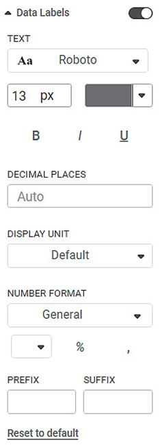
The table given below describes different fields present on Data Label formatting.
Field | Description | Remark |
|---|---|---|
Text | It allows you to change the appearance of the data label text. |
|
Decimal Places | It allows you to select the number of decimal places up to which you want any variable value to be displayed. | By default, the calculated value is displayed in the data label. This value can be up to any number of decimal places. |
Display Unit | It allows you to select the multiples of units in which the variable is measured. | You can select any of the following units
Default indicates that the unit is assigned automatically by parsing the range of the data. That is, Thousands/Millions/Billions/Trillions is automatically assigned based on the data. |
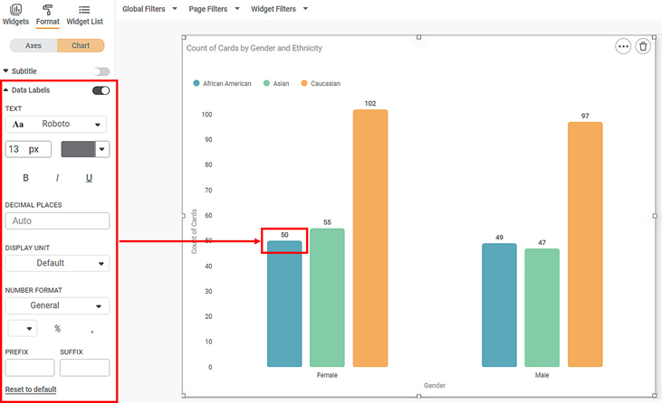
To use Data Labels formatting options, first plot a Column Chart using the dimensions and measures from the dataset. For example, we plot a Column Chart of the Count of Cards against Gender. The Ethnicity of the sample is the Legend dimension.
The figure given below shows an original image of the Column Chart. By default,
- The font type is Montserrat, the font size is 14, and the default color is used.
- The decimal places and the display unit are auto-selected.
Now,
- Change the data label text font type, font size, and, font color.
- Change the number of decimal places up to which you want to display the values.
- Change the display unit of the value in the data label. In the chart below, we select the display unit as 'Thousand'. The original data values remain the same, however, now they are converted in terms of thousand. For example, a value of 50 will become 0.05K.
The resultant widget is shown below.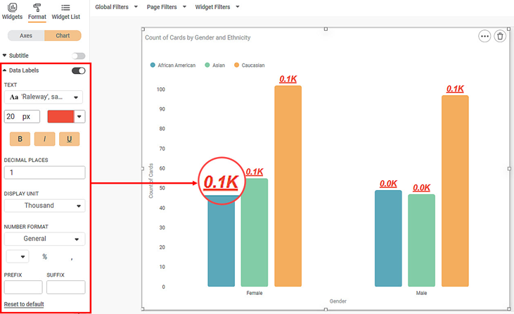
Related Articles
Overlap Option in Data Labels
Overview An Overlap toggle option is available in Data Labels settings to control the visibility of overlapping data labels on charts. The visibility of data labels depends on factors such as available chart space, font size, number of data points, ...Data Labels in Pie and Donut Charts
Refer Data labels for using general formatting options for the charts. Along with these options, Pie and Donut charts are provided with additional formatting options. The below options are available with their respective formatting options- Figure 1: ...Card Chart Data Labels Datetime formatting
Card chart when plotted with Date/Interval column types with Minimum/Maximum aggregation shows the Minimum/Maximum date out of that column. Default date format is displayed in ISO format. The customization for datetime can be done using the available ...Data Compare
Data Compare is located under Model Studio ( ) in Data Preparation, in the task pane on the left. Use the drag-and-drop method to use the algorithm in the canvas. Click the algorithm to view and select different properties for analysis. In the Data ...Live Data
Data visualization is the representation of data in the form of pictures, images, graphs, or any other form of visual illustration. In RubiThings, Live Data is visualized in the form of Line Chart, SolidGauge, and Speedometer. To fetch the live data, ...