Creating Charts using Widgets
To create a chart using widgets, follow the steps given below.
- Open the Dashboard in edit mode. Refer to Editing a Dashboard.
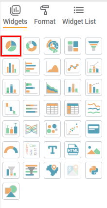
The Dashboard is displayed. In the WIDGETS pane, click the widget you want to use.
Note:
Hover over any widget to see its name and the number of dimensions and measures required to plot it.
The selected widget is added to the dashboard canvas.
Select the widget added on the dashboard canvas. For example, here we consider a Column Chart.
The corresponding Configuration settings are displayed in the WIDGETS pane.Notes:
- The Configuration setting varies depending upon the selected chart.
- You can add multiple widgets on one canvas.
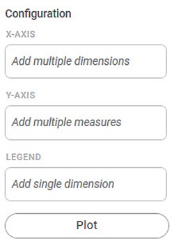
From the DATA pane, drag-and-drop the DIMENSIONS and MEASURES in the appropriate Configuration fields, and then click Plot.
For example, here we drag-and-drop Gender in X-Axis, Average Income in Y-Axis, and Married in Legend.Note: You can add new columns to your dashboard by Adding Calculated Column to Dashboard. 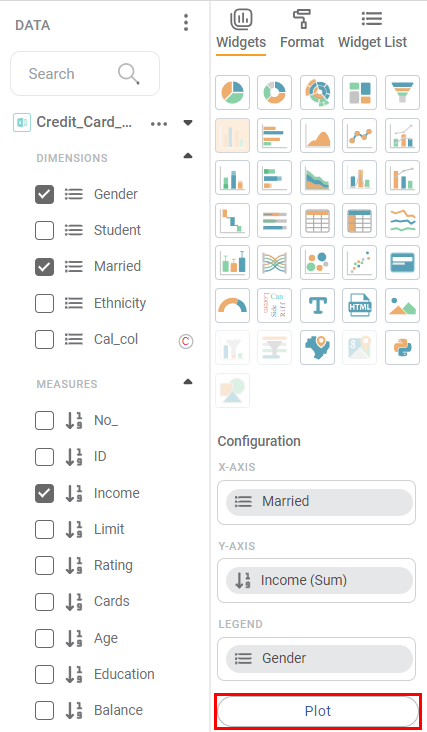
The chart is plotted depending upon the dimensions and measures added in the configuration.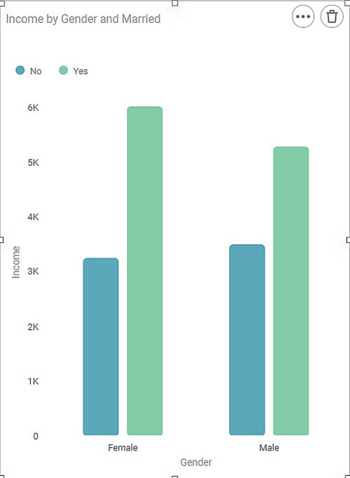
| Notes: |
|


Related Articles
Show Hide Charts
You can hide a widget if it is not required to be displayed on the dashboard for any reason. The multiple scenarios for using this functionality are given below. Scenario 1: Show/Hide a Chart Manually For hiding a widget manually, click Widget List, ...Creating a Map Widget
In RubiSight, you can create a map widget if your dataset contains geographical variables. Geographical Variable In RubiSight, a new variable type called geographical is added to represent a location. It is supported for the below-listed location ...Sorting Data in Widgets
You can sort a widget based on the variables present in the chart. The default sorting of the chart is as per the data from the input dataset. For charts with legend, if you select a feature as a Legend, the numerical variable plotted on the Y-axis ...Using a Parameter
You can use the created parameter in any of the widgets on the dashboard. You can change the values in the selected Calculated Column based on the value of the selected Parameter. Using a Numerical Parameter To use a created Numerical Parameter, ...Creating Visualization using Widgets on Dashboard
You can create different visualizations using the different types of widgets provided by RubiSight. When the same data is represented in different ways, it can give different insights and help the decision-making process. The following sections ...