Plot Area
The Plot Area refers to that part of the chart where the widget is plotted. For example, in a bar chart, the plot area lies between the X and Y axes.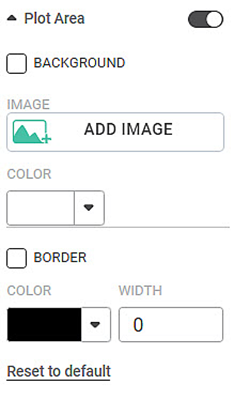
The table given below describes different fields present for Plot Area formatting.
Field | Description | Remark |
|---|---|---|
Background Image | It allows you to insert an image in the background of the widget. |
|
Background Color | It allows you to select a suitable color for the background of the widget. | You can either select an image or a color for the background. |
Border Color | It allows you to give a colored border to the background which is either colored or filled with an image. |
|
Border Width | It allows you to select the width of the colored border. |
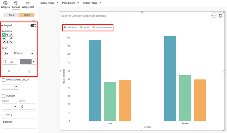
To use Plot Area formatting options, first plot a Column Chart using the dimensions and measures from the dataset. For example, we plot a Column Chart of the Count of Cards against Gender. The Ethnicity of the sample is the Legend dimension.
The figure given below shows an original image of the Column Chart. By default,
- There is no background image for the plotted chart.
- The background color is the color of the canvas.
- The plot area is not bordered.
Now,
- Click ADD IMAGE.
- Select an image from your device that you want to set as a background image.
In the chart below, we have selected the Rubiscape logo as the background image. The image appears in the background of the graph in the plot area.
The resultant widget is shown below.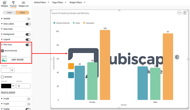
Now,
- Clear the checkbox for BACKGROUND.
- Change the color of the plot area.
- Also, select the border color and border width for the plot area.
The resultant widget is shown below.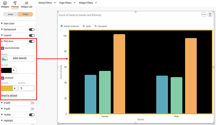
Related Articles
Plot Area- Configure Radius for Pie/Donut Charts
Refer Plot Area for other formatting options. The formatting for the radius options in Pie/Donut charts can be done using Radius formatters in Plot Area formatter for respective charts. Donut Chart Radius Formatter: The 2 formatter options are ...Plot Type
The Plot Type formatting option is available in the Combination Chart. The table given below describes different fields present for Plot Type formatting. Field Description Remark Column Organization of data in the column. The values are: CLUSTER – ...Generate and Plot Charts
Generate and Plot Charts RubiAI lets you generate the chart based on user prompts and also enables user to plot the chart in the Rubisight dashboard. Generate and plot option is available from Edit mode of the dashboard. From view mode user can ...Plot Band Configuration in Solid Guage Chart
Plot bands in a Solid Gauge chart are used to visually segment the gauge's scale into color-coded ranges. These helps highlight zones such as 'Low', 'Medium', 'High', or indicate threshold levels. Plot bands are static. Plot band configuration is ...Chart Type
The figure below shows the formatting fields in the chart type dropdown. To use Chart Type formatting options, first plot a Sparkline Chart using the dimensions and measures from the dataset. For example, we plot a Sparkline Chart of Ethnicity ...