Formatting the Axis
You can format the axes for charts that contain any one or both of the two axes, that is, the X-axis and Y-axis. It is possible only in charts where we have axial variables.
To format the axis, follow the steps given below.
- Create the number of charts as required. Refer to Creating Charts using Widgets.
- Select the widget that you want to format.
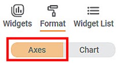
- In the WIDGET pane, click FORMAT.
Depending on the selected type of widget, the formatting options are displayed. - Click Axis.
- Click the axis that you want to format.
For example, here, we consider X-Axis.
The formatting options for the X-Axis are displayed. - To enable and format a field, turn the corresponding toggle button ON (
 ).
).
For example, here, we have enabled the General field.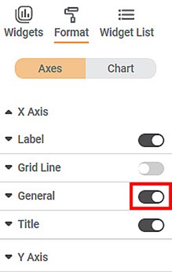
- Click General. All the formatting options within the General field are displayed.
You can change,
- Width of the axis
- Color of the axis
- Minimum Column / Bar Width
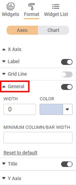
Similarly, for Axis, you can format other fields like Axis Label, Axis Title, and Grid Lines to format the axis as required.
|
|
Related Articles
Comma Format Options in Number Formatting
Overview Comma Format options allow users to display numbers based on region-specific digit grouping and separators. These options are available under the Comma Format dropdown and are enabled only when comma formatting is turned ON. Supported across ...Formatting Y-axis
This formatting allows you to change the various parameters associated with the Y-axis. The figure given below shows the available formatting options for Y-axis. The subsequent sections describe different fields present on Y-axis formatting.Formatting X-axis
This formatting allows you to change the various parameters associated with the X-axis. The figure given below shows the available formatting options on X-axis. The subsequent sections describe different fields present on X-axis formatting.Axis
Here, the word 'Axis' refers to the X-axis. The figure below shows the various fields present in the Axis formatting in the X-axis. The table given below describes different fields available for Axis formatting for X-axis. Field Description Remark ...Formatting an Axis
You can format the axes for charts that contain any one or both two axes, that is, the X-axis and the Y-axis. It is possible only in charts where we have axis variables.