Scale to Fit
Scale to Fit allows you to change the Widget visualization fit in View Mode depending on the available space. Hence, after selecting any of these options, click Save and switch to View Mode to visualize the fit.
A vertical and horizontal scroll bar is provided if the dashboard page contains an appreciably large widget, or several widgets plotted. The table given below describes different fields present on widget page formatting.
Type | Description | Remark |
Page | It creates a widget visualization where the widget gets fitted strictly in the selected Page Size (16:9, 4:3, Letter, or Custom) |
|
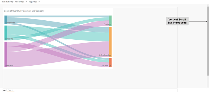
Width | It creates a widget visualization where the entire width of the available space in View Mode is used. | If needed, a vertical scroll bar is provided to ensure that the entire page is visible. |
Standard | It creates a widget visualization where the widget is fitted to its standard size. |
|
To use the Scale to Fit formatting options, first plot a widget using appropriate dimensions and measures from the dataset. For example, we plot a Sankey Chart of the Count of Quantity by Segment and Category. By default, the Scale To Fit type selected is Page.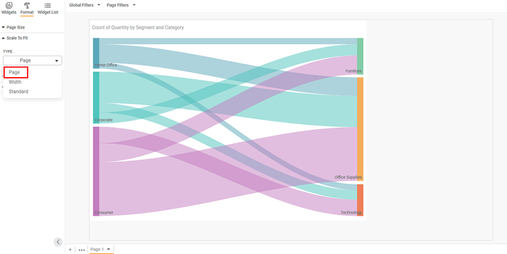
Now, click Save and then View Mode. The chart visualization is as seen below. The space on the two sides of the canvas is empty.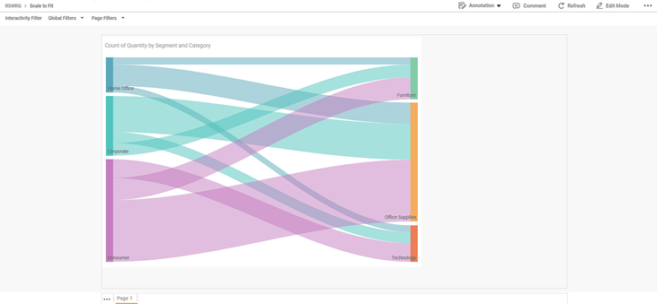
Now, navigate back to the Edit Mode and change the Page To Fit type to width. Click Save, and then View Mode. The chart visualization is as seen below.
Similarly, change the Page To Fit type to Standard. Click Save, and then View Mode. The chart visualization is as seen below.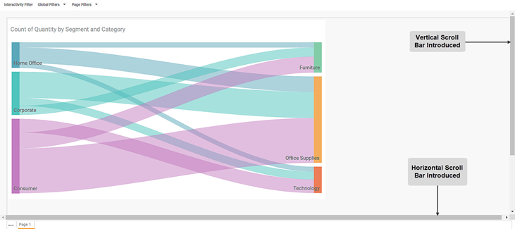
Related Articles
Chi Square Goodness of Fit Test
Chi Square Goodness of Fit Test is located under Model Studio ( ) in Hypothesis Test, in Statistical Analysis, in the left task pane. Use the drag-and-drop method to use the algorithm in the canvas. Click the algorithm to view and select different ...Canvas Grid Functionality
Grid support helps designers align and organize visuals precisely on the canvas using an underlying layout structure. Overview Grid is available for Rubisight Designers The grid is visible only in Edit Mode It helps in maintaining consistent spacing ...Exporting a Dashboard
Exporting a dashboard helps you to store/save the dashboard on the system. You can then share or view the dashboard in PDF and PPT format. When you export a dashboard, all the pages present in the dashboard are exported. To export a dashboard, follow ...Export to PDF/PPT using Dashboard Schedule
In RubiSight, you can export a dashboard using the Export functionality. Refer to Exporting a Dashboard. You can not only schedule this export, but also send the dashboard pages as PDF via email, at a stipulated date and time. Notes: You can schedule ...Geneal
General settings are associated with the line which is used to represent the Y-axis. The table given below describes different fields present in General formatting on Y-axis. Field Description Remark Width It allows you to select the width of the ...