Category
The Category formatting option is available in the Card widget. You can use this option to change the appearance of data on the chart.
By default, the Category formatting options are not visible. Turn the toggle button ON () to use the Category formatting options.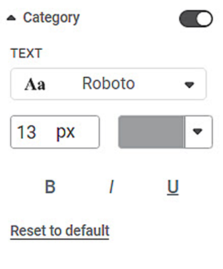
The table given below describes different fields present in Category formatting.
Field | Description | Remark |
|---|---|---|
Text | It allows you to change the appearance of the data label Text. |
|
To use Category formatting options, first plot a Card chart using the measures from the dataset. For example, we plot a Card Chart of Income.
The figure given below shows an original image of the Card Chart.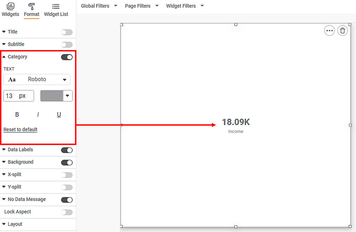
Now,
- Change the Category text font type, font size, and font color.
- Make the text bold, italic, and underline it.
The resultant widget is shown below.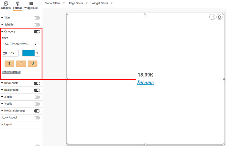
Related Articles
Drill Through with Keep All Filters
Drill Through with Keep All Filters This option is available from Rubisight dashboard edit mode. This option is available in page format settings. This is used to carry forward all applicable filters on the respective chart which is drilled through. ...Contextual Data Tooltips
Tooltip configuration allows you to display additional information from the source dataset that is not directly plotted on the chart. This enhances data visibility by providing contextual insights when users hover over chart elements. Overview ...Global Filters
Global filters are always available whenever we plot charts in a dashboard. Global filters are applied to all the charts in a given dashboard. This feature is especially useful when more than one dataset is used in the dashboard, and there are common ...Drill Through from Chart to Page with Context Filtering
Drill Through Filters (Page Level) Overview Drill Through Filter option is available at the page level in the Filter Pane and is accessible from Edit/View/Outer modes. It enables navigation from one widget to another page while passing contextual ...Percentage Calculations
For widgets like pie charts and donut charts, it is sometimes required to display the values as a percentage of the share of each section in the total share. For this, Rubiscape provides a Percentage functionality alongside the Aggregation methods to ...