Using Annotations on a Dashboard
Annotations are used to add more information in a widget. The annotations are added in the form of numbers and text.
To annotate a dashboard, follow the steps given below.
- Open the Dashboard in edit mode. Refer to Editing a Dashboard.
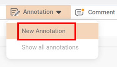
The Dashboard is displayed. - On the function pane, in the top right corner, click Annotation.
- To insert an annotation, click New Annotation and click at the position where you want to add the annotation.
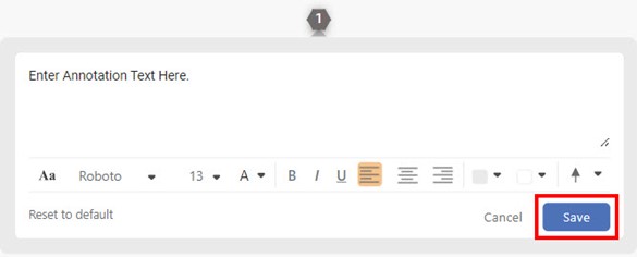
Enter the annotation text in the text field and click Save.
Note:
You can also use different formatting options that are available to format your annotation text.
The annotation number is added to the chart. You can click the annotation number to view the saved annotation text.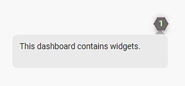
Notes:
- You can add any number of annotations to a chart.
- You can click and drag the annotation number on a chart and change its position as required.
- You can edit the annotation. Click the annotation number, and hover over the annotation text, and then click the Edit icon.
- You can delete the annotation. Click the annotation number, and hover over the annotation text, and then click the Delete icon.
- On the dashboard, you can choose to show or hide the annotations. To do so, On the function pane, click Annotation and then click Show all annotations. The annotations are shown or hidden depending upon the status of the option.
Related Articles
Configuring Dashboard from Mobile View
Refer Navigate Mobile View to access the Mobile View. Refer Mobile View introduction for getting details of the sections available in the Mobile View and why this configuration is required. Navigate to Mobile View of canvas for configuring dashboard ...Using Dashboard Hierarchies
In a data dictionary, you can rearrange or change the order of the features in the newly created dataset using the Hierarchy function. The created hierarchy is used in the RubiSight application. To use the created hierarchy in a dashboard, follow the ...Refreshing Dashboard using Scheduled Workflow
The dashboards that you create are static, meaning the dashboard views do not change if the data they represent is changed. For this, you can use the refresh function provided by RubiSight. Refer to Refreshing a Dashboard. However, there can be ...Export to PDF/PPT using Dashboard Schedule
In RubiSight, you can export a dashboard using the Export functionality. Refer to Exporting a Dashboard. You can not only schedule this export, but also send the dashboard pages as PDF via email, at a stipulated date and time. Notes: You can schedule ...Using Filters
When you plot a chart, all the data in the dataset is not required to be used. Also, within the data used, there might be sub-categories that you want to plot separately. You can view classified results in the charts using filters. Filters help you ...