Data Color
Data Color formatting option allows you to select the color of the data displayed on the chart.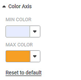
The table given below describes different fields present on Data Color formatting.
Field | Description | Remark |
|---|---|---|
Default Color | It allows you to select the color of the widgets. |
|
This option is available in almost all charts. In this example, we are using a Column Chart.
To use the Data Color formatting option, first plot a Column Chart using the dimensions and measures from the dataset. For example, we plot a Column Chart of the Count of Cards against Gender. The Ethnicity of the sample is the Legend dimension.
The figure given below shows an original image of the Column Chart. By default, the data colors are selected in the Trevilla theme. The number of colors used depends upon the number of legends in the chart.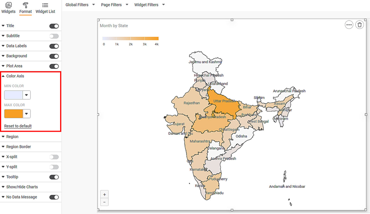
Now change each data color individually. The resultant widget is shown below.
Related Articles
Data Labels
Data labels refer to the text, values, or a combination of both, that appear on a chart. For example, a data label on a Column chart gives you information about the variable plotted on the Y-axis corresponding to that column. By default, the data ...No Data Message
No Data Message formatting option is available in all the widgets. No Data Message appears if The inadequate or wrong type of variables are selected to plot a widget Incoming data to the chart is empty (Wrong filter configuration) By default, the ...Color Axis
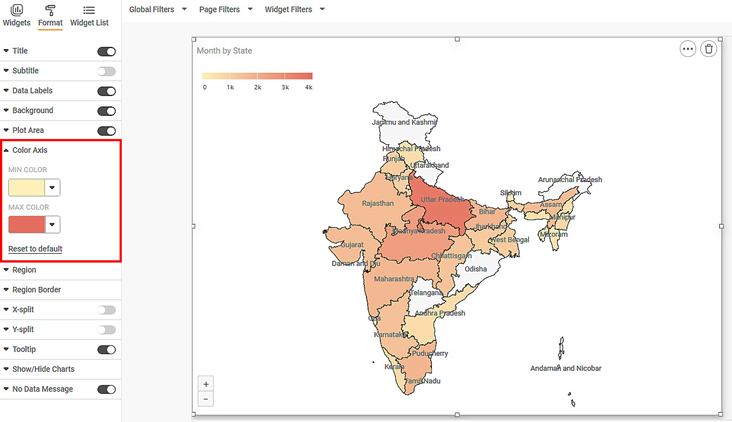
The Color Axis formatting option is available for Map chart. The table given below describes different fields present for Color Axis formatting. Field Description Remark Min Color It allows you to change the color of the Minimum value on the Map ...Data Compare
Data Compare is located under Model Studio ( ) in Data Preparation, in the task pane on the left. Use the drag-and-drop method to use the algorithm in the canvas. Click the algorithm to view and select different properties for analysis. In the Data ...Live Data
Data visualization is the representation of data in the form of pictures, images, graphs, or any other form of visual illustration. In RubiThings, Live Data is visualized in the form of Line Chart, SolidGauge, and Speedometer. To fetch the live data, ...