Rooted in Data: Visualizing India’s Agricultural Story
Indian agriculture has always been a story of complexity and
uncertainty, shaped by shifting weather patterns, rising input costs, and vast
regional differences in productivity. For decades, the data holding the key to
these challenges has been fragmented and difficult to interpret.
That’s where Rubiscape comes in. AI-powered business intelligence platform transforms
over two decades of agricultural records into rich, interactive dashboards. We
turn disconnected numbers into compelling visual stories, enabling researchers,
policymakers, and agri-experts to uncover trends, monitor performance, and make
critical decisions based on real evidence.
Why Visual Analytics Matter in the Field?
Modern farming generates enormous amounts of data-from
rainfall and crop yields to seasonal cycles and land usage. Without the right
tools, this valuable resource remains untapped. Rubiscape cuts through this
complexity by organizing and visualizing data in real-time, making it easy to
extract insights and take timely, effective action.
Unlocking the Story in the Data: Insights from 1997-2020
So, what does Rubiscape reveal about India’s agricultural
journey? Let’s explore the key findings from our analysis spanning 1997 to
2020.
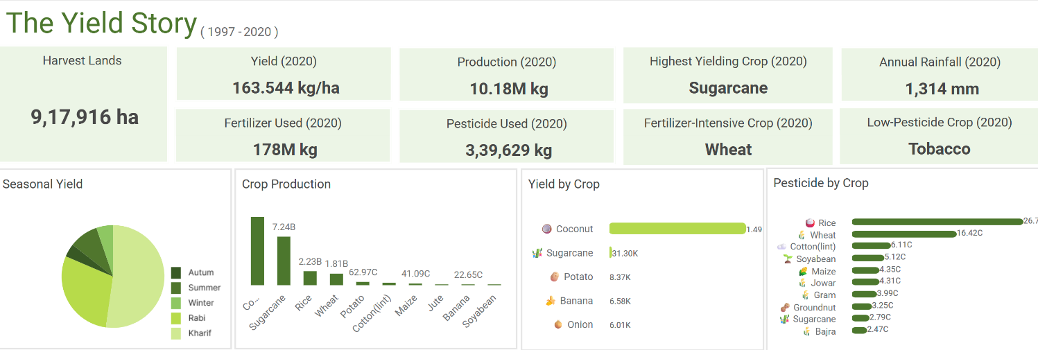
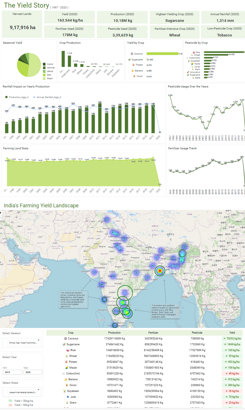
A Snapshot of the 2020 Harvest
Dashboard provides a high-level overview of India's
agricultural performance for the most recent year in the dataset (2020):
Key Metrics for 2020: The analysis covered 9.17 lakh hectares of harvested land, yielding a total crop production of 10.18 million kg. This was achieved with 178 million kg of fertilizer and 3.39 lakh kg of pesticides.Crop-Specific Highlights:Highest Yield: SugarcaneMost Fertilizer-Intensive: WheatLowest Pesticide Usage: TobaccoSeasonal Performance: The Kharif season was the most productive, with an average yield of 20.43K kg/ha, while the Autumn season was the lowest at 1.62K kg/ha.
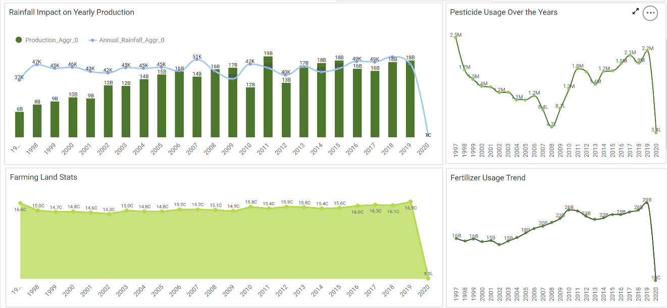
The Big Picture: Long-Term Trends (1997-2020)
Interactive time-series charts reveal the broader patterns
over 24 years:
Fertilizer
vs. Pesticide Use: Fertilizer application shows a significant and steady
rise, increasing by nearly 80% over the period. In contrast, pesticide use
follows a non-linear trend, declining until 2008 before gradually
rebounding.
Rainfall
and Production Stability: Annual rainfall and crop production have
remained largely stable. The data indicates a period of steady production
growth until 2009, followed by a plateau.
Plateau in Cultivated Land: The total area of cultivated land shows minimal variation, suggesting that agricultural expansion has leveled off. This highlights the critical need to boost productivity on existing land.Overall Top Performers (1997-2020):Highest Overall Yield: Coconut (1.49M kg/ha)Highest Pesticide Consumption: Rice (26.79 cr kg)The 2020 Anomaly: A noticeable dip in fertilizer, production, and cultivated land is visible in 2020, likely reflecting the widespread disruptions caused by the COVID-19 pandemic.
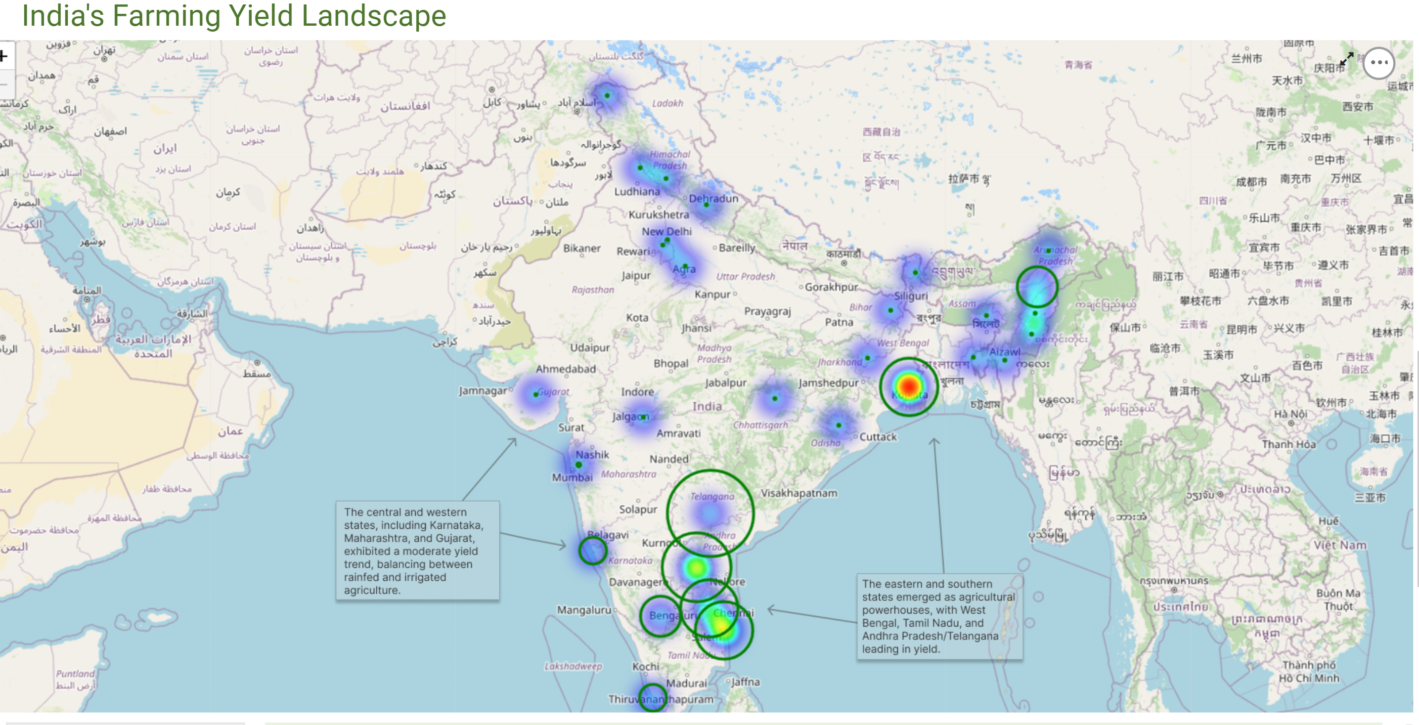
A Map of Productivity: The Geospatial Landscape
Geospatial heatmap brings regional disparities to life,
color-coding each state by its average crop yield.
High-Yielding States: Eastern and Southern states, including Andhra Pradesh, Tamil Nadu, West Bengal, and Telangana, consistently demonstrate higher agricultural yields.Mid-Range Performers: States like Maharashtra, Gujarat, and Karnataka show moderate yields, reflecting a mix of rain-fed and irrigated farming practices.
Interactive Exploration
Dashboard puts the power of discovery in your hands. You
can customize the entire data view with precision using interactive filters:
Isolate by Season: Analyze the performance of monsoon-dependent vs. winter crops.Define Your Timeframe: Compare a recent 5-year period against the 20-year average.Drill Down by State: Uncover why one state outperforms its neighbour.
From Data to Decisions
By combining interactive filters across years, seasons,
crops, and states, the Rubiscape platform offers a powerful and intuitive way
to explore over two decades of India’s agricultural data. What was once locked
away in static spreadsheets is now brought to life through dynamic visuals and
AI-generated narratives. We make complex data easy to understand and act on,
driving smarter, evidence-based decisions to shape the future of Indian
agriculture.
Click here to explore the dashboard – you can interact with it, apply filters and see what insights emerge.
Recent Topics
Grid in RubiSight
Rubi AI
From Numbers to Insights, EV Sales Intelligence Dashboard is Live!
Electric Vehicles are not just a trend anymore… they are reshaping mobility in India. So instead of looking at static reports, we built something decision-makers can actually use. We’re excited to share our EV Sales Analytics Dashboard (FY 2023–2024)Air Quality Insights Across Indian Metros
As the festive season fills the skies with lights, it’s also important to keep an eye on what’s in the air we breathe. 🌫️ Rubiscape presents the Air Quality Insights a visual exploration of how pollution levels change across Indian metros, especiallyThe Smart Way to Highlight Insights: Conditional Formatting in RubiSight
When you look at a dashboard, what’s the first thing that grabs your attention? Chances are, it’s the colours. Imagine scanning through a sales report where declining revenues are instantly highlighted in red, while top-performing regions glow in green.Bug in RubiFlow Scheduler
I was trying to 'Schedule' option in my rubiflow, there I filled all the appropriate fields. But when I try to click on the 'active' option, then 'update'. but still the status of that scheduler is 'deactive'. basically the scheduler is not saving theRooted in Data: Visualizing India’s Agricultural Story
Indian agriculture has always been a story of complexity and uncertainty, shaped by shifting weather patterns, rising input costs, and vast regional differences in productivity. For decades, the data holding the key to these challenges has been fragmentedMake Sense of BI—Now at Your Fingertips with Rubiscape Mobile
In today’s fast-paced digital world, waiting for insights is no longer an option. Business decisions must happen in real time—whether you’re in a boardroom, on the shop floor, or catching a flight. The traditional desktop-bound BI model no longer meetsShowroom to Service Bay: How Rubiscape Redefines Automotive Intelligence
In today’s data-driven world, the automotive industry is experiencing rapid transformation. With evolving customer preferences, rising competition, and the growing importance of after-sales services, the need for deeper, data-backed decision-making hasWhat truly powers great dashboards, sharp analytics, and confident decision-making?
It’s not just the tools we use — it’s the foundation beneath them. Let’s shine a light on the unsung heroes of Business Intelligence — the essential elements that transform raw data into trusted insights: Data Modeling: Designing with Purpose Every strongA Deep Dive into Christmas Gift Sales Analysis using Rubisight
Unwrapping the Festive Cheer: A Deep Dive into Christmas Gift Sales The holiday season is a time of joy, cheer, and, of course, gift-giving. As retailers gear up for the next festive season, understanding the nuances of consumer behaviour and sales trendsUnwrapping the Festive Cheer: A Deep Dive into Christmas Gift Sales Analysis
Unwrapping the Festive Cheer: A Deep Dive into Christmas Gift Sales The holiday season is a time of joy, cheer, and, of course, gift-giving. As retailers gear up for the next festive season, understanding the nuances of consumer behaviour and sales trendsI have a doubt
What are the differences between supervised and unsupervised learning?Building structured data storage strategy for Things data
IOT data packets are generally dependent on the sensors, devices ,gateways, systems that generate them. Also this data can be structured or unstructured. For the sake of this post lets talk about structured data and challenges to build a mechanism ofAbout the RubiStudio category
This category consists of all topic discussions related to data preparation & modeling, machine learning, forecasting, textual analytics, and Pro Code possible with RubiStudio.Quick Use of Data Dictionary and Workflow
Data Dictionary: With the use of pre-existing datasets, a new data dictionary can be produced. It enables you to create new datasets while reusing the existing ones and incorporating new features. By leveraging the preexisting datasets, the Data DictionaryFlow of Information using Sankey Chart in RubiSight
A Sankey chart, also known as a Sankey diagram or flow diagram, is a type of data visualization that represents the flow of resources, energy, or other quantities between multiple entities or categories. It is often used to visualize the distributionSecuring Your Data at Every Level: Introducing Rubisight’s Data Level Security
In the digital age, data governance and security have emerged as paramount concerns for organizations across industries. With the proliferation of data breaches and regulatory requirements, safeguarding sensitive information and ensuring compliance hasInfographics and Specialized Widgets: When to Use, Best Practices, and Limitations
RubiSight widgets, also known as charts, are the building blocks of visual data storytelling dashboards within the Rubiscape platform. They are essentially visual representations of your data that help you explore, understand, and communicate insightsHow to include drill-down to details option?
Question - For example, I have 10 records. 7 of which are ok, 3 are not ok. On dashboard I want to show count and aggregated values for 7 and 3 respectively. And details of 3 or 7 records should be available on user demand. There are two ways to drillUse of HTML for Bookmarking in Rubisight
What is bookmarking? How do we achieve it using Power BI? Bookmarking is a common feature in various data visualization tools, and it generally refers to the ability to save and revisit a specific state or view of a report/dashboard. This feature allowsRubisight Filters Explained: Finding Insights Faster
Rubisight filters help you focus on specific data within your dashboard, making it easier to spot trends and gain valuable insights. Here are the three main types: 1. Global Filters: Apply the same filter criteria to all pages on a dashboard. Useful forBanking Analytics: Reimagining the Way Banks Do Business
Created a Comprehensive dashboard on Banking Analytics. With banking products becoming increasingly commoditized, Analytics can help banks differentiate themselves and gain a competitive edge. This dashboard showcase trends that help management in decisionRubisight Overview - Key Functionalities
Find the dashboard used in Rubisight Overview Session. This dashboard demonstrated most of the functionalities in Rubisight platform. The funcationalities used in the dashboard are as follows - Data Dictionary used for Rubisight dashboard creation. CalculatedLeBron James vs. Michael Jordan: The Greatest Debate in Basketball History
My new Viz on Rubisight Shapes - This entire dashboard is prepared based on shapes and filters. The debate over who is the greatest basketball player of all time, LeBron James or Michael Jordan, has captivated fans and analysts for years. Both athletesOutlier Detection
Outlier Detection Description Outlier Detection reveals the extreme values that deviate from the rest of the data in a real-world dataset. Why to use Numerical Analysis – Data Preparation When to use When there are certain values in the data which significantlyHardik vs Rohit - An Inhouse Rivalry!
The Big Debate - Hardik vs Rohit ---- Mumbai Indians are already out of the IPL and whose fault !!! Is it Hardik ??? The news sources are debating on the two former Indian Player, is it a correct debate ? image723×712 181 KB Find the stats in RubisightHow to convert the data type for a specific data point in Rubiflow?
In Rubiflow once the data node is processed, you can use an expression from the Data preparaion function (Data integration) and connect to the data source node. In that you will be able to see a functions on the left side - “Convert”, through this functionalityWelcome to Community
The Community hub inside Zoho Desk lets you build a powerful community around your business, while still serving customers via other channels. Your customers can post 4 types of content within your community. These are Ideas, Questions, Problems and Discussions.
Topic Participants
shweta.darade