The Smart Way to Highlight Insights: Conditional Formatting in RubiSight
When you
look at a dashboard, what’s the first thing that grabs your attention? Chances
are, it’s the colours. Imagine scanning through a sales report where
declining revenues are instantly highlighted in red, while top-performing
regions glow in green. That’s the magic of conditional formatting it
turns raw numbers into powerful visual cues.
In this
blog, we’ll explore how RubiSight, Rubiscape’s advanced BI platform,
makes conditional formatting not just possible, but seamless and impactful.
Whether you’re a business analyst, a data scientist, or a decision-maker,
you’ll see how easy it is to highlight patterns, exceptions, and insights at a
glance.
Why Conditional Formatting Matters
Data
tells a story, but without the right emphasis, the story can get lost.
Conditional formatting helps:
Spot
anomalies quickly–
Instantly detect underperforming KPIs or unusual spikes.
Prioritize attention – Guide stakeholders to what truly matters.
Make dashboards intuitive – Reduce cognitive load with visual cues.
Think of
it as highlighter pens for your data.
How RubiSight Makes It Simple
Unlike
traditional BI tools where conditional formatting can feel tedious, RubiSight
offers an intuitive, no-code way to apply it. Here’s a step-by-step
walkthrough:
Step 1: Choose Your Widget
Select
the visualization (table, chart, or KPI card) where you want to apply
formatting.
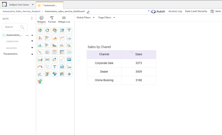
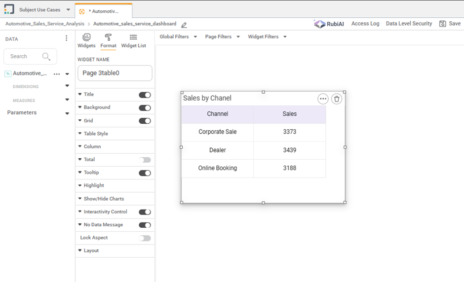
Step 2: Access Highlights from Formatting
In the
widget properties panel, navigate to Format.
From format navigate to Highlight and click on Apply.
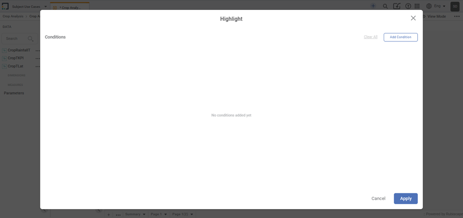
Step 3: Define Your Rule
Click on Add Condition
Select the field/measure (e.g., Sales).
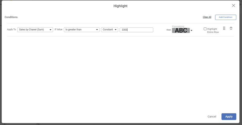
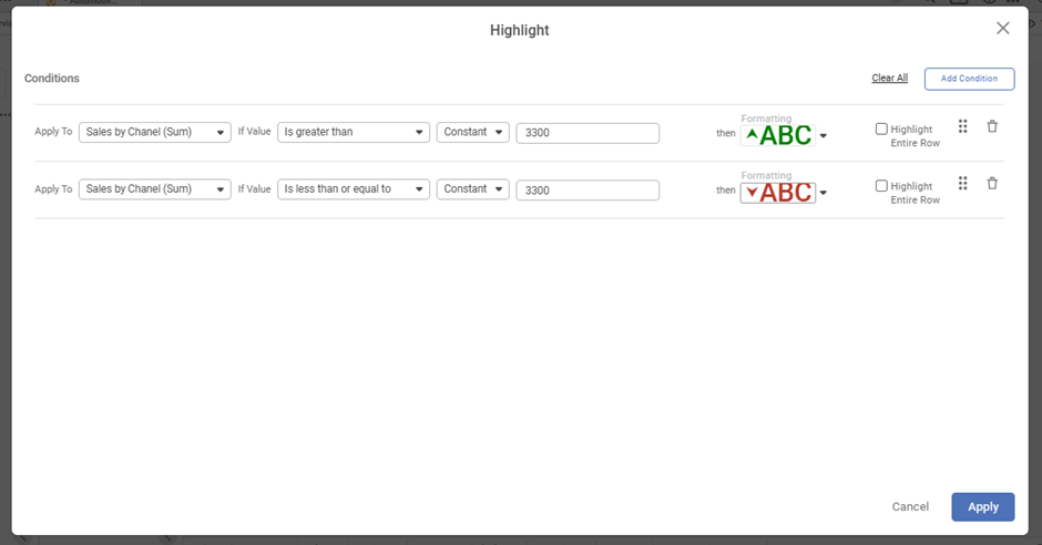
Set a condition (e.g., If Sales >3300, colour = Green).
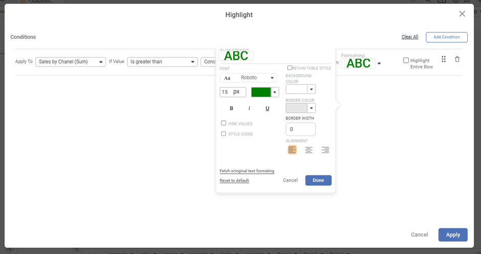
Choose
how you want to highlight it (text colour, background, icon)
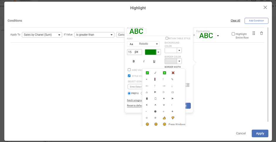
You
can add multiple Conditions
Step 4: Apply and Visualize
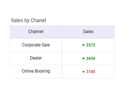
Click Apply,
and instantly see your data transform into a more engaging, insightful view.
Real-World Example
Let’s say
you’re building a Customer Support Dashboard. With RubiSight’s
conditional formatting, you can:
Highlight tickets pending beyond SLA in red.
Show high customer satisfaction scores in green.
Apply a gradient scale to average resolution time shorter times in green, longer times in red.
Now,
instead of manually digging through data, decision-makers can see the story
unfold instantly.
Pro Tips for Maximum Impact
Don’t
overdo it– Too
many colours can confuse rather than clarify.
Use brand colours – Align formatting with your company’s theme for
consistency.
Think business-first – Tie rules to meaningful thresholds, not arbitrary
numbers.
Conditional
formatting in RubiSight is more than just a cosmetic feature it’s a
storytelling superpower. It bridges the gap between complex datasets and human
decision-making, ensuring that insights aren’t just visible, but unforgettable.
So, next
time you design a dashboard, don’t just present the data. Highlight the
story.