Showroom to Service Bay: How Rubiscape Redefines Automotive Intelligence
In today’s data-driven world, the automotive industry is experiencing rapid transformation. With evolving customer preferences, rising competition, and the growing importance of after-sales services, the need for deeper, data-backed decision-making has never been greater. This is where Rubiscape steps in to drive innovation and growth across every layer of the automotive sector.
Why BI Matters in Automotive
Whether you're a manufacturer, dealer, or service provider, you're constantly gathering massive volumes of data from vehicle sales and service records to customer feedback and inventory levels. Traditional methods can’t keep up with the pace of analysis required. Rubiscape helps transform this raw data into meaningful, visual insights that empower smart business decisions.
Unlocking Insights with Rubiscape’s GEN AI
What makes this even more powerful is Rubiscape’s GEN AI. With just a few clicks, I was able to generate actionable insights and automated narratives directly from the dashboard. GEN AI helped interpret trends, pinpoint anomalies, and suggest strategic improvements, saving time and delivering deeper business intelligence without manual effort.
Curious about what the data revealed?
Here’s what Rubiscape GEN AI uncovered from the dashboard:
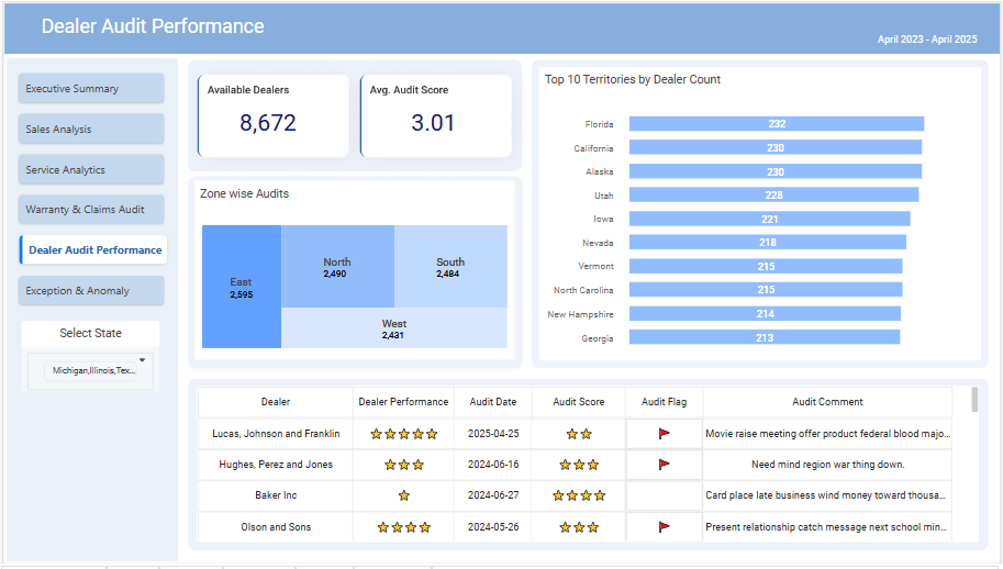
Executive Summary
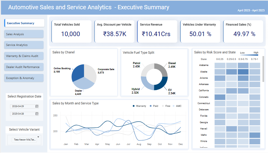
Key Performance Indicators (KPIs):
- Total Vehicles Sold: 10,000 – This is a strong indicator of overall sales performance. Further analysis is needed to determine if this is growth or decline compared to previous periods.
- Average Discount per Vehicle: ₹38.57K – This suggests a significant discount is being offered on average. Investigate the reasons behind these discounts (e.g., competitive pressure, clearing inventory). Analyze the impact on profitability.
- Service Revenue: ₹10.41 Crores – This represents the revenue generated from service operations. Compare this to previous periods and benchmark against industry averages.
- Vehicles Under
Warranty: 50.01% – A high percentage, possibly indicating a strong
warranty program or a large number of recently sold vehicles. However,
high warranty claims could negatively impact profitability. Analyze
warranty claim co
sts. - Financed Sales: 49.97% – Almost half the sales are financed. This shows reliance on financing options. Assess the risk associated with financing and explore alternative sales strategies.
Sales Channel Analysis:
- Dealer: Shows the largest sales channel contribution. It's important to continue investing and improving this channel.
- Corporate Sales: The second largest. Explore opportunities for growth in this segment.
- Online Booking: The smallest contribution. Investigate why online bookings are lagging and implement improvement strategies.
Vehicle Fuel Type:
- Relatively even distribution across Petrol, Diesel, Hybrid, and EV. This indicates a diverse product offering catering to various customer preferences. Further analysis is needed to understand the profitability of each fuel type and market demand trends.
Sales by Month and Service Type:
- This chart displays seasonal variations in sales and service demand. It would be valuable to analyze the reasons behind peak and low periods. The data needs further analysis to determine if this reflects a genuine business trend or a random variation.
Sales by Risk Score and State:
- This heatmap shows sales performance across different states and risk scores. States with higher risk scores might require targeted marketing or stricter credit policies. This visualization requires further drill-down analysis to discover actionable insights at the state level. A deeper dive to understand the cause of high or low risk in each state is crucial.
Overall Insights and Recommendations:
- Profitability Analysis: While the dashboard shows strong sales volumes, a deep dive into profitability is crucial. Analyze the impact of high average discounts on the bottom line.
- Warranty Management: The high percentage of vehicles under warranty requires monitoring of warranty claims and their associated costs.
- Sales Channel Optimization: Continue focusing on the high-performing dealer channel while investing in strategies to boost online booking sales.
- Targeted Marketing: Utilize the sales by risk score and state data to implement more targeted marketing and sales strategies.
- Seasonality: Develop strategies to address the seasonal variation in sales and service demands.
- Data Granularity: The dashboard provides high-level views; more granular data (e.g., individual dealer performance, customer demographics, etc.) would allow for more in-depth analysis.
In
conclusion, the Executive Summary provides
a good overview of key performance indicators. However, a deeper analysis of
the underlying data is necessary to uncover more actionable insights and drive
strategic decision-making. Consider adding key metrics such as customer
acquisition cost, customer lifetime value, and return on investment (ROI) for a
more comprehensive view of business performance.
Sales Analysis
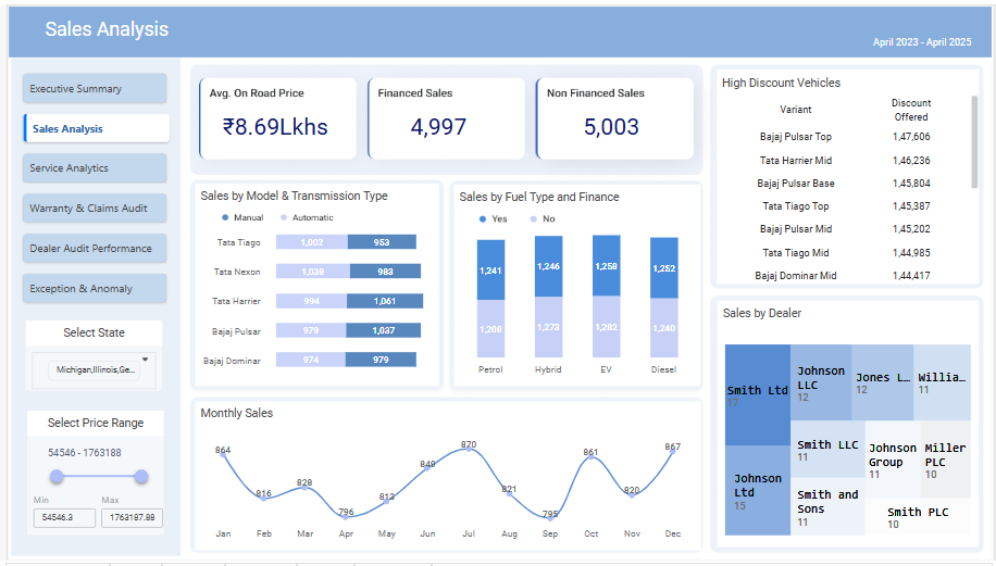
Overall Sales Performance:
- Total Sales: A total of 10,000 vehicles were sold (4,997 financed + 5,003 non-financed). This indicates a relatively even split between financed and non-financed sales.
- Average On-Road Price: The average on-road price is ₹8.69 Lakhs. This is a key metric for understanding the average value of vehicles sold.
- Monthly Sales Trend: Monthly sales show some seasonality, with peaks in July and December, and a trough in April. This suggests potential factors influencing sales throughout the year (e.g., promotional periods, seasonal demand). Further investigation is needed to understand the reasons behind this trend.
Vehicle Performance:
- Popular Models: Tata Tiago and Tata Nexon are among the top-selling models, indicating strong customer preference for these vehicles. The Bajaj Pulsar also performs well.
- Transmission Preference: There's a slight preference for manual transmissions over automatic transmissions across most models. This might indicate price sensitivity or preference for manual driving. The disparity is not significant though.
- Fuel Type: The sales data across fuel types (petrol, hybrid, EV, diesel) shows slight variations but no overwhelming preference for one type of fuel over others.
Sales Channels:
- Dealer Performance: There's variation in sales performance across different dealerships. Smith Ltd is the top-performing dealer. Investigating best practices from high-performing dealers might benefit other dealerships.
- High Discount Vehicles: Specific vehicle variants (Bajaj Pulsar Top, Tata Harrier Mid, etc.) are offered with significant discounts, suggesting potential inventory management challenges or strategies to clear stock.
Financial Aspects:
- Financing: The nearly equal split between financed and non-financed sales suggests a healthy balance in customer payment options. Further analysis could reveal customer segments who prefer either financing or cash purchases.
In summary, the
dashboard provides a good overview of sales performance. However, deeper dives
into specific aspects, as outlined above, are necessary to extract actionable
insights and improve sales strategies.
GEN AI didn’t just
visualize the data it told a story.
[Note: Data analysis for the study is performed on synthetic data]
Recent Topics
Grid in RubiSight
Rubi AI
From Numbers to Insights, EV Sales Intelligence Dashboard is Live!
Electric Vehicles are not just a trend anymore… they are reshaping mobility in India. So instead of looking at static reports, we built something decision-makers can actually use. We’re excited to share our EV Sales Analytics Dashboard (FY 2023–2024)Air Quality Insights Across Indian Metros
As the festive season fills the skies with lights, it’s also important to keep an eye on what’s in the air we breathe. 🌫️ Rubiscape presents the Air Quality Insights a visual exploration of how pollution levels change across Indian metros, especiallyThe Smart Way to Highlight Insights: Conditional Formatting in RubiSight
When you look at a dashboard, what’s the first thing that grabs your attention? Chances are, it’s the colours. Imagine scanning through a sales report where declining revenues are instantly highlighted in red, while top-performing regions glow in green.Bug in RubiFlow Scheduler
I was trying to 'Schedule' option in my rubiflow, there I filled all the appropriate fields. But when I try to click on the 'active' option, then 'update'. but still the status of that scheduler is 'deactive'. basically the scheduler is not saving theRooted in Data: Visualizing India’s Agricultural Story
Indian agriculture has always been a story of complexity and uncertainty, shaped by shifting weather patterns, rising input costs, and vast regional differences in productivity. For decades, the data holding the key to these challenges has been fragmentedMake Sense of BI—Now at Your Fingertips with Rubiscape Mobile
In today’s fast-paced digital world, waiting for insights is no longer an option. Business decisions must happen in real time—whether you’re in a boardroom, on the shop floor, or catching a flight. The traditional desktop-bound BI model no longer meetsShowroom to Service Bay: How Rubiscape Redefines Automotive Intelligence
In today’s data-driven world, the automotive industry is experiencing rapid transformation. With evolving customer preferences, rising competition, and the growing importance of after-sales services, the need for deeper, data-backed decision-making hasWhat truly powers great dashboards, sharp analytics, and confident decision-making?
It’s not just the tools we use — it’s the foundation beneath them. Let’s shine a light on the unsung heroes of Business Intelligence — the essential elements that transform raw data into trusted insights: Data Modeling: Designing with Purpose Every strongA Deep Dive into Christmas Gift Sales Analysis using Rubisight
Unwrapping the Festive Cheer: A Deep Dive into Christmas Gift Sales The holiday season is a time of joy, cheer, and, of course, gift-giving. As retailers gear up for the next festive season, understanding the nuances of consumer behaviour and sales trendsUnwrapping the Festive Cheer: A Deep Dive into Christmas Gift Sales Analysis
Unwrapping the Festive Cheer: A Deep Dive into Christmas Gift Sales The holiday season is a time of joy, cheer, and, of course, gift-giving. As retailers gear up for the next festive season, understanding the nuances of consumer behaviour and sales trendsI have a doubt
What are the differences between supervised and unsupervised learning?Building structured data storage strategy for Things data
IOT data packets are generally dependent on the sensors, devices ,gateways, systems that generate them. Also this data can be structured or unstructured. For the sake of this post lets talk about structured data and challenges to build a mechanism ofAbout the RubiStudio category
This category consists of all topic discussions related to data preparation & modeling, machine learning, forecasting, textual analytics, and Pro Code possible with RubiStudio.Quick Use of Data Dictionary and Workflow
Data Dictionary: With the use of pre-existing datasets, a new data dictionary can be produced. It enables you to create new datasets while reusing the existing ones and incorporating new features. By leveraging the preexisting datasets, the Data DictionaryFlow of Information using Sankey Chart in RubiSight
A Sankey chart, also known as a Sankey diagram or flow diagram, is a type of data visualization that represents the flow of resources, energy, or other quantities between multiple entities or categories. It is often used to visualize the distributionSecuring Your Data at Every Level: Introducing Rubisight’s Data Level Security
In the digital age, data governance and security have emerged as paramount concerns for organizations across industries. With the proliferation of data breaches and regulatory requirements, safeguarding sensitive information and ensuring compliance hasInfographics and Specialized Widgets: When to Use, Best Practices, and Limitations
RubiSight widgets, also known as charts, are the building blocks of visual data storytelling dashboards within the Rubiscape platform. They are essentially visual representations of your data that help you explore, understand, and communicate insightsHow to include drill-down to details option?
Question - For example, I have 10 records. 7 of which are ok, 3 are not ok. On dashboard I want to show count and aggregated values for 7 and 3 respectively. And details of 3 or 7 records should be available on user demand. There are two ways to drillUse of HTML for Bookmarking in Rubisight
What is bookmarking? How do we achieve it using Power BI? Bookmarking is a common feature in various data visualization tools, and it generally refers to the ability to save and revisit a specific state or view of a report/dashboard. This feature allowsRubisight Filters Explained: Finding Insights Faster
Rubisight filters help you focus on specific data within your dashboard, making it easier to spot trends and gain valuable insights. Here are the three main types: 1. Global Filters: Apply the same filter criteria to all pages on a dashboard. Useful forBanking Analytics: Reimagining the Way Banks Do Business
Created a Comprehensive dashboard on Banking Analytics. With banking products becoming increasingly commoditized, Analytics can help banks differentiate themselves and gain a competitive edge. This dashboard showcase trends that help management in decisionRubisight Overview - Key Functionalities
Find the dashboard used in Rubisight Overview Session. This dashboard demonstrated most of the functionalities in Rubisight platform. The funcationalities used in the dashboard are as follows - Data Dictionary used for Rubisight dashboard creation. CalculatedLeBron James vs. Michael Jordan: The Greatest Debate in Basketball History
My new Viz on Rubisight Shapes - This entire dashboard is prepared based on shapes and filters. The debate over who is the greatest basketball player of all time, LeBron James or Michael Jordan, has captivated fans and analysts for years. Both athletesOutlier Detection
Outlier Detection Description Outlier Detection reveals the extreme values that deviate from the rest of the data in a real-world dataset. Why to use Numerical Analysis – Data Preparation When to use When there are certain values in the data which significantlyHardik vs Rohit - An Inhouse Rivalry!
The Big Debate - Hardik vs Rohit ---- Mumbai Indians are already out of the IPL and whose fault !!! Is it Hardik ??? The news sources are debating on the two former Indian Player, is it a correct debate ? image723×712 181 KB Find the stats in RubisightHow to convert the data type for a specific data point in Rubiflow?
In Rubiflow once the data node is processed, you can use an expression from the Data preparaion function (Data integration) and connect to the data source node. In that you will be able to see a functions on the left side - “Convert”, through this functionalityWelcome to Community
The Community hub inside Zoho Desk lets you build a powerful community around your business, while still serving customers via other channels. Your customers can post 4 types of content within your community. These are Ideas, Questions, Problems and Discussions.
Topic Participants
shweta.darade